What does a designer do when her school is having a winning season—unexpectedly good by historical standards—and she learns there’s an athletics exhibition opening on campus? She makes a poster for it, of course.
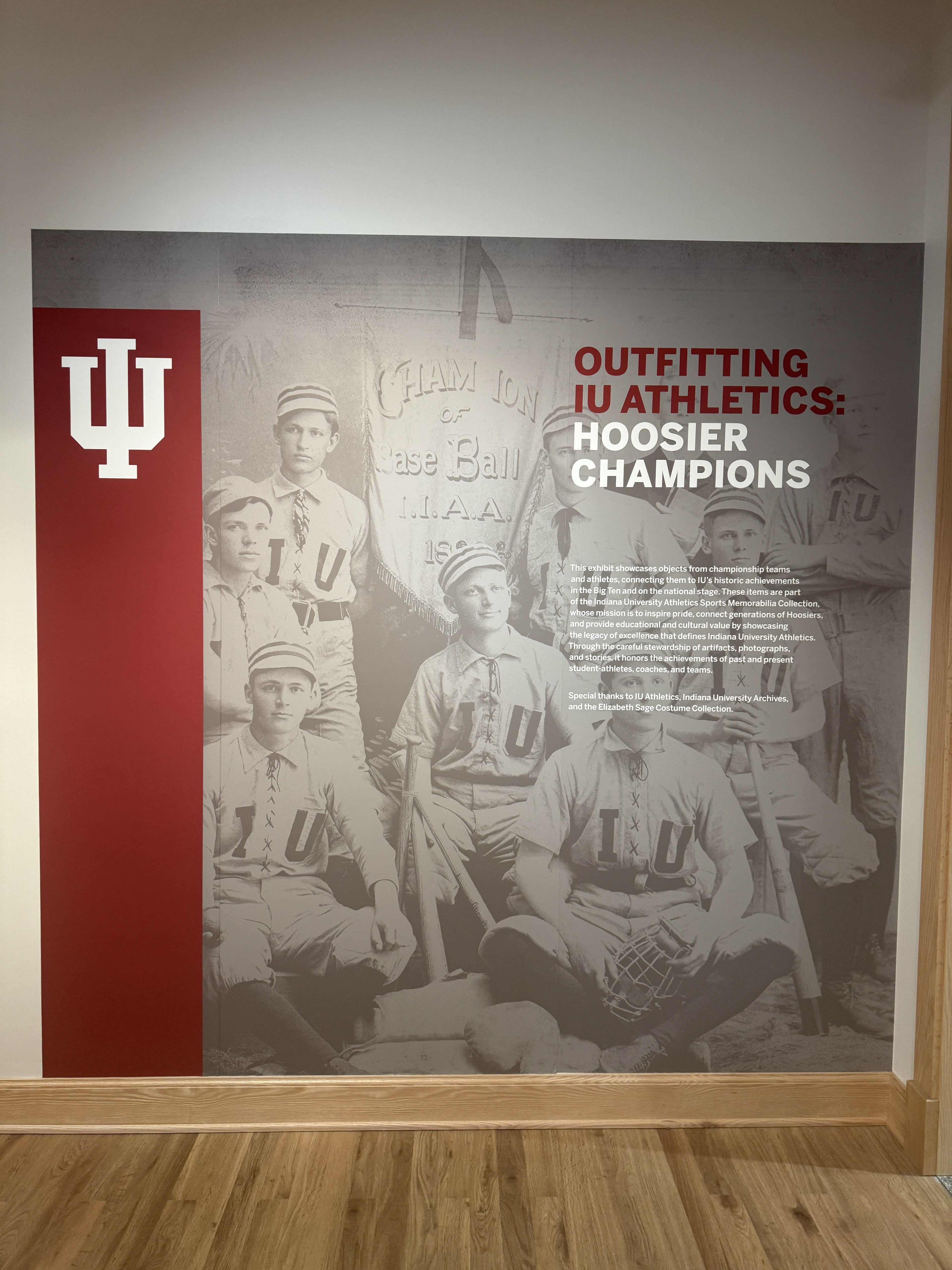
At the time, I was taking a Curatorship course with Dr. Heather K. Calloway. As part of the class, we were studying existing exhibitions in the historic McCalla School building as inspiration while developing our own collection and exhibition. When I learned about the IU Athletics exhibition, I was immediately excited—not only because of the exhibition itself, but because our football team was suddenly on the rise and undefeated after being historically… not great. Riding that momentum, I knew right away I wanted to make a poster for the opening reception.
I brought the idea to Heather, and she was enthusiastic and supportive, giving me full creative freedom. From there, the poster became a personal response to the exhibition rather than an official piece of exhibition branding.
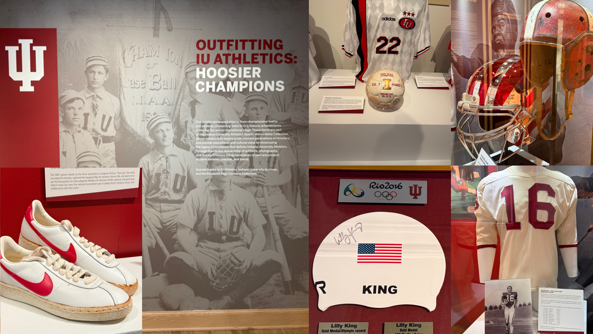
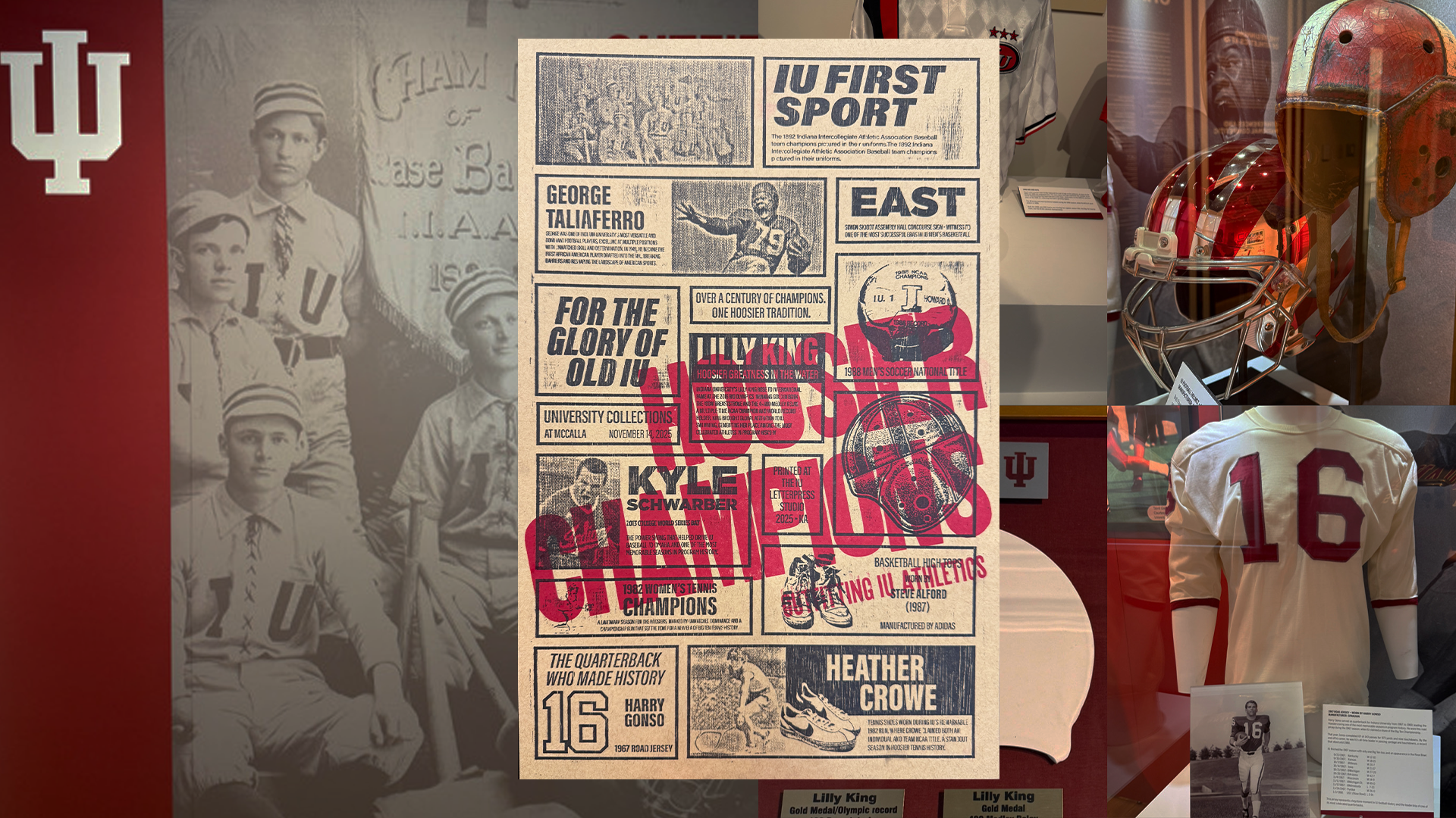
Because the exhibition spans more than 100 years of IU athletics history, I wanted the poster to feel timeless—like you couldn’t quite tell when it was made. I took inspiration from vintage advertising cuts, especially those found in old newspapers. My goal was to create something physical that felt like sports ephemera, not museum graphics.
I began by photographing several key pieces from the exhibition using my phone—objects and moments that stood out to me visually. I brought those images into the computer, converted them to black and white, and further processed them using halftones and thresholding so they would translate cleanly for laser cutting. From there, I built a grid structure inspired by historic newspaper layouts. The modularity, structure, and one-color approach felt like a perfect fit for the project. Finding the right rhythm took some trial and error—very much a Tetris-style process of nudging elements until everything felt balanced rather than awkward or forced.
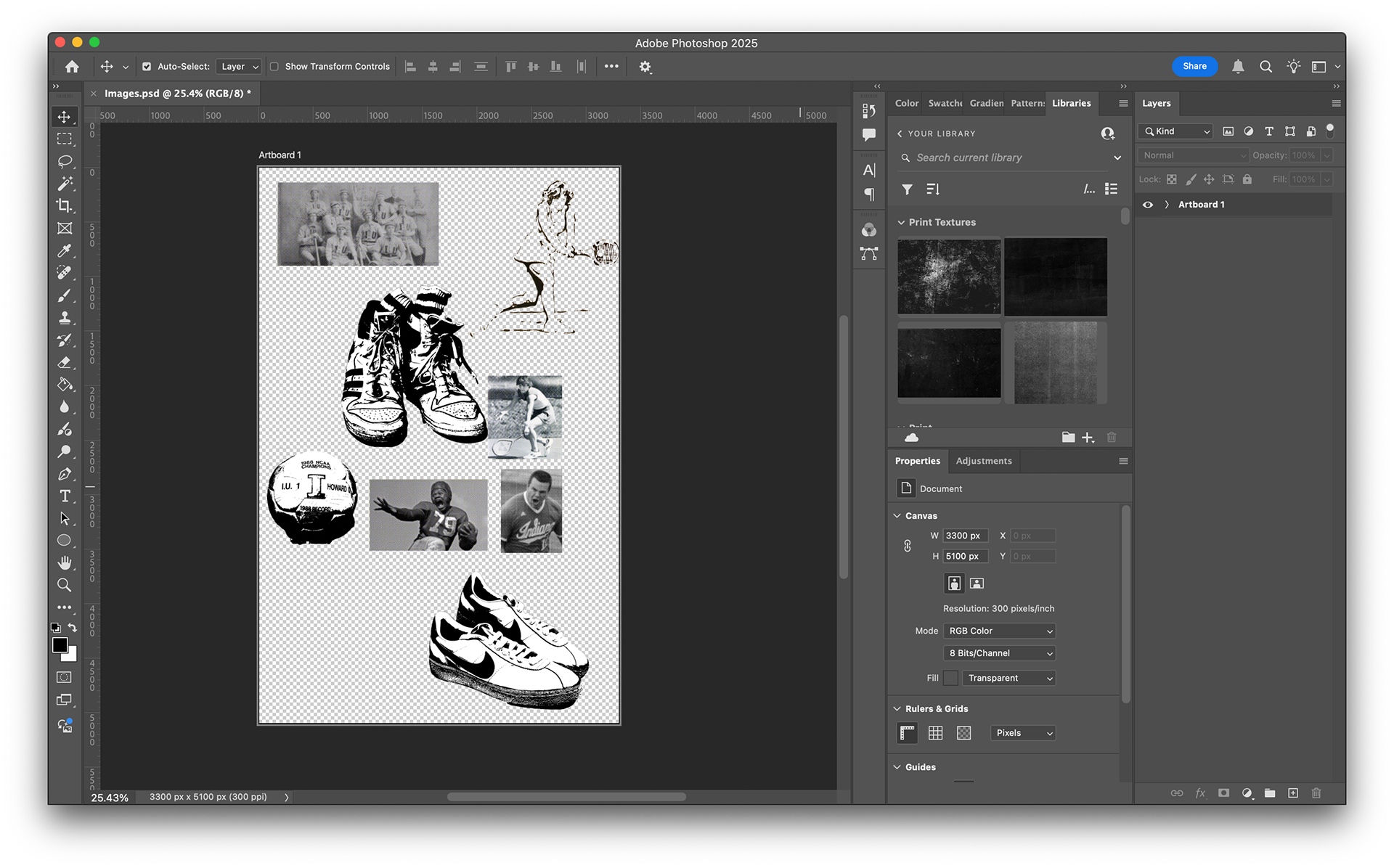
Photoshop file and editing the photographs.
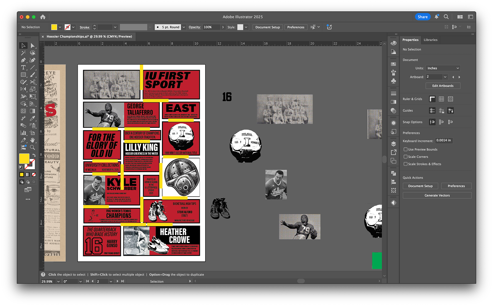
First version of the poster in Adobe Illustrator. Checking alignment.
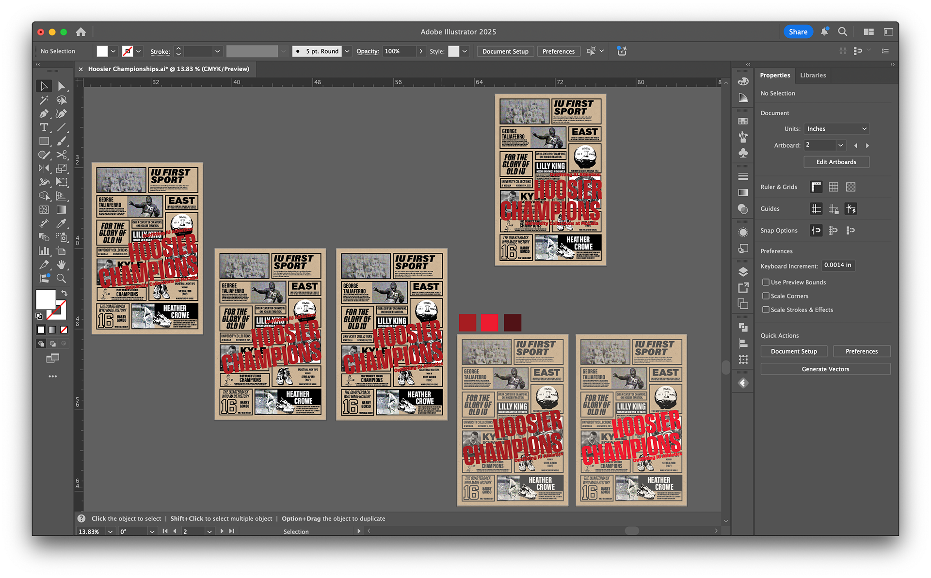
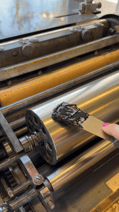
Checking color options and which red works best on the kraft paper plus black first layer.
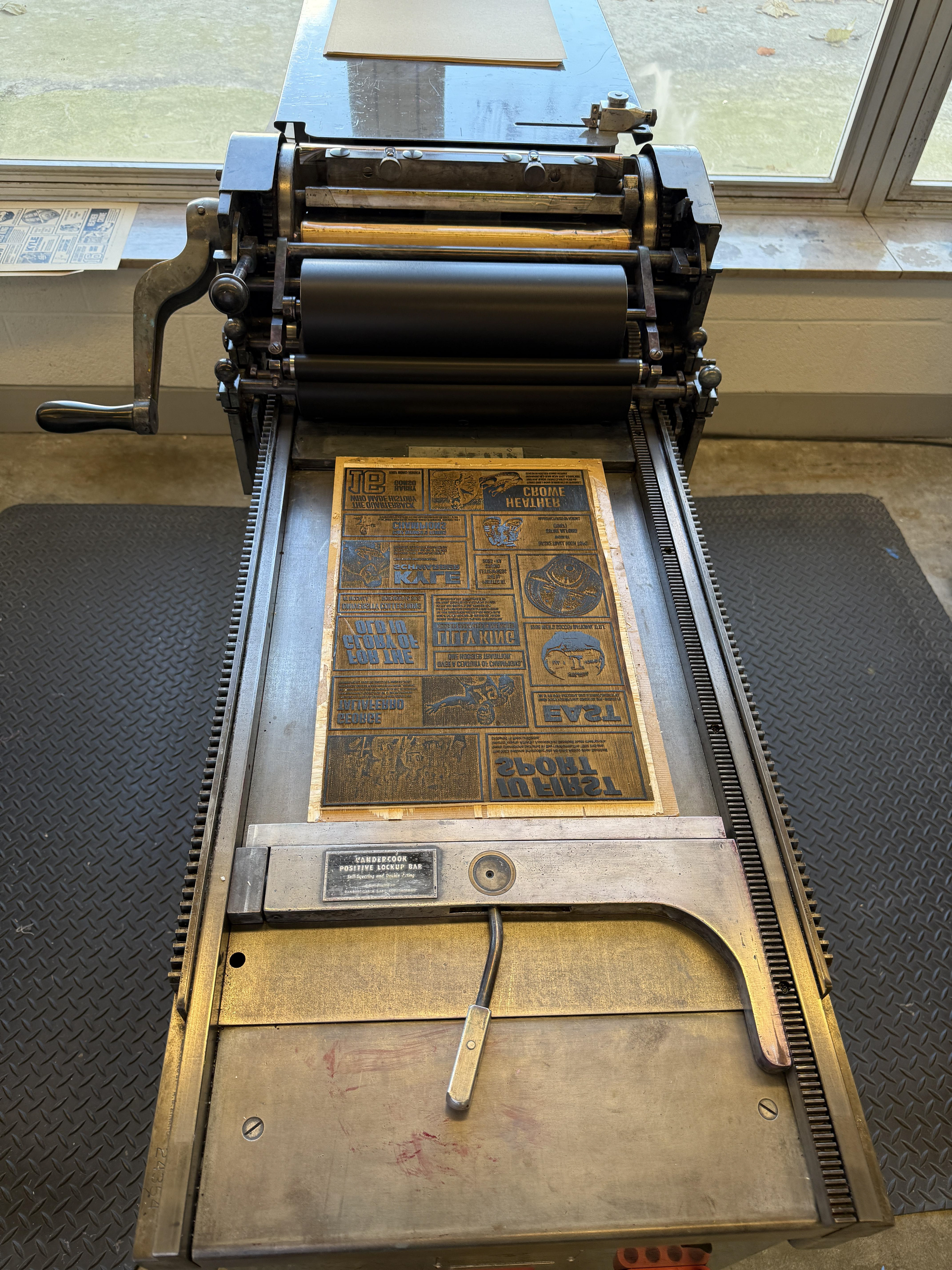
Once the design was finalized, I flipped the file for printing and took it to the school’s fabrication lab to laser-cut the imagery into Luan wood. It’s a cheap, low-quality material, which results in visible grain and texture when printed—but in this case, that imperfection worked in my favor and reinforced the vintage feel. After cutting, I mounted the block to bring it to type height and took it to press.
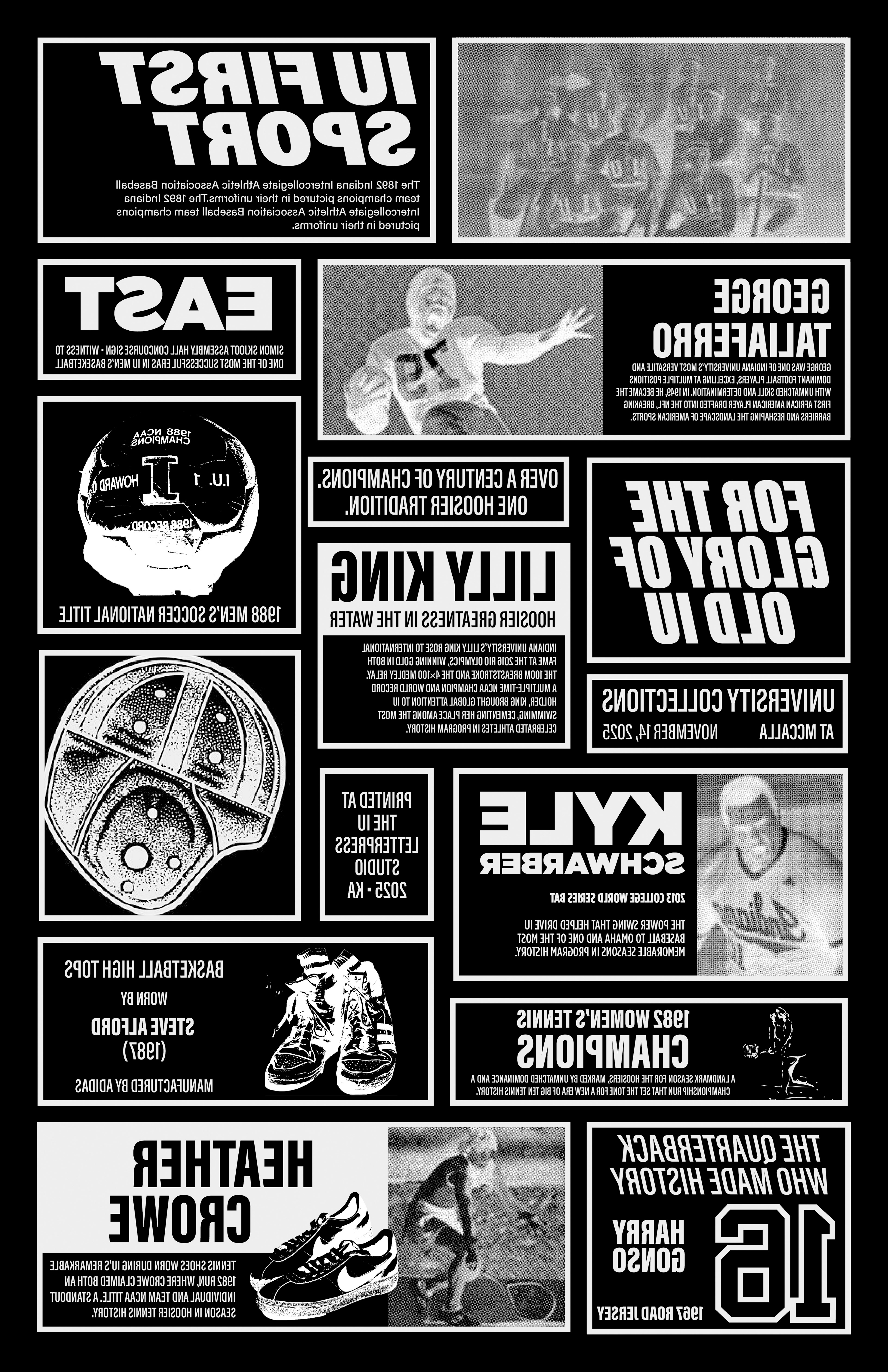
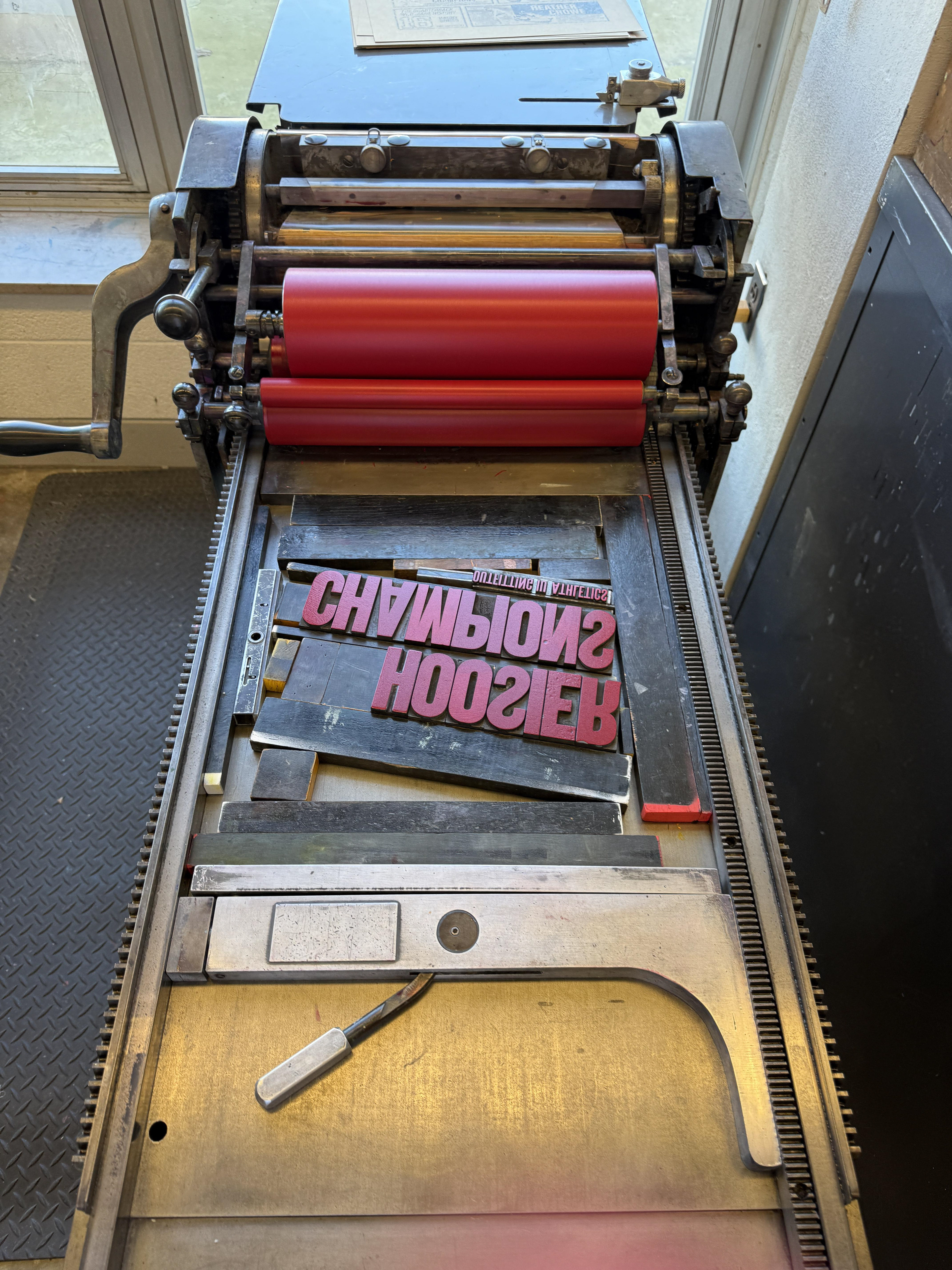
I printed the imagery in black on kraft paper to further lean into the newspaper ephemera reference. Once that layer was finished, I moved on to the title. I originally planned to include a secondary headline—“Outfitting IU Athletics”—under the main title “Hoosier Champions,” but I ran out of the necessary wood type characters. In the end, omitting the subtitle simplified the composition and made the final poster stronger. I locked up “Hoosier Champions” on a diagonal on the Vandercook press, mixed an ink as close as I could get to Indiana University’s Pantone 201 C, and printed the final layer.
As a graphic designer, I believe we exist somewhere between designer and artist—but ultimately, we are curators. We curate type, imagery, materials, client needs, audience expectations, production constraints, and context. The work is about synthesizing all of those inputs, identifying what matters most, and balancing them into something that communicates clearly while still having personality and impact.
Designing and printing this poster was a personal response to the exhibition, and it was genuinely fun to make. I’m grateful to everyone on the Collections team for supporting the idea and letting me create my “silly little poster.” It’s been especially rewarding to see the prints pop up around campus, in offices, and beyond.
Go Hoosiers!!!
Related context: IU News coverage of the Athletics Exhibition