Background
In 1948, Richard Stack founded Dick’s Sporting Goods after borrowing 300 dollars from his grandmother. It has remained a family-owned business after being purchased by Richard’s children in the early 1980s. Ed Stack, Dick’s son, is the current CEO and Chairman of DICK’S Sporting Goods and with the help of his siblings is responsible for taking two stores and growing the chain to over 500 stores.
Dick’s reached a significant milestone on October 5th, 2002, when it went public on the New York Stock Exchange. Dick's Sporting Goods also owns and operates Golf Galaxy and Field & Stream specialty stores, as well as Dick’s Team Sports HQ, an all-in-one youth sports digital platform offering scheduling, communications and live scorekeeping through its GameChanger mobile apps, free league management services, custom uniforms, and fan wear and access to sponsorships.
Rational
The goal of this rebrand is to re-establish Dick’s Sporting Goods as the go-to supplier for women’s athletic wear. Partnerships will achieve this with other large athletic wear like Gym Shark and title nine. With this new facet of the Dick’s Sporting Goods brand, it will establish an expansion between other brands in the market. The brand needs a new story and life to continue to set it apart from other competitors and the rise of online retailers.
Purpose
Increase brand awareness (especially in the women’s department), visually identify and modernize the brand.
Logos
Current Logo
Proposed New Logo

White

One Color

Simplified

Black
Collateral & Ephemera
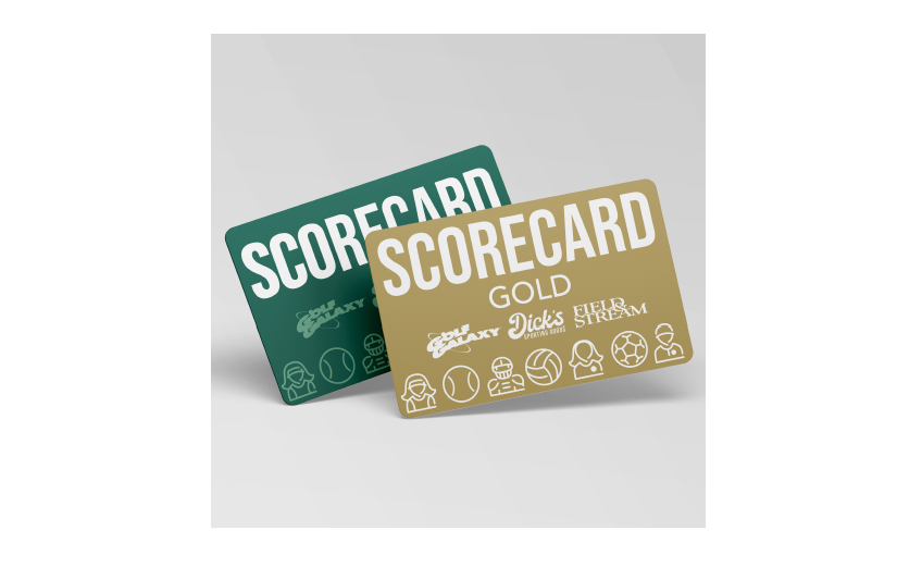
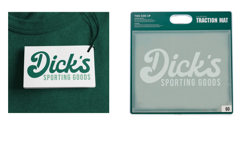
Items purchased frequently in stores were selected for this portion of the project and are consistent with the new branding. The polo shirts are for managers and all in-store employees will wear the lanyards. The membership card and credit card were re-branded to match the new wordmark. The interior store ads feature bright photographs of athletes in action along with simple supporting text.



Website
The website was updated to feature the new brand color light green and also the new logo. Better user experience was kept in mind as well as flexibility for new sales promotions and special messages. Overall the website features a new and improved store and contact pages.
Business System
The identity system was designed to be consistent with the brand standards and supporting elements. The icons were used to create interest and increase engagement. The base color of white was chosen to keep printing costs down. All pieces feature the new logo and wordmark.
Business cards are below. On the left is the back of the card and the right is the font.

Back

Front
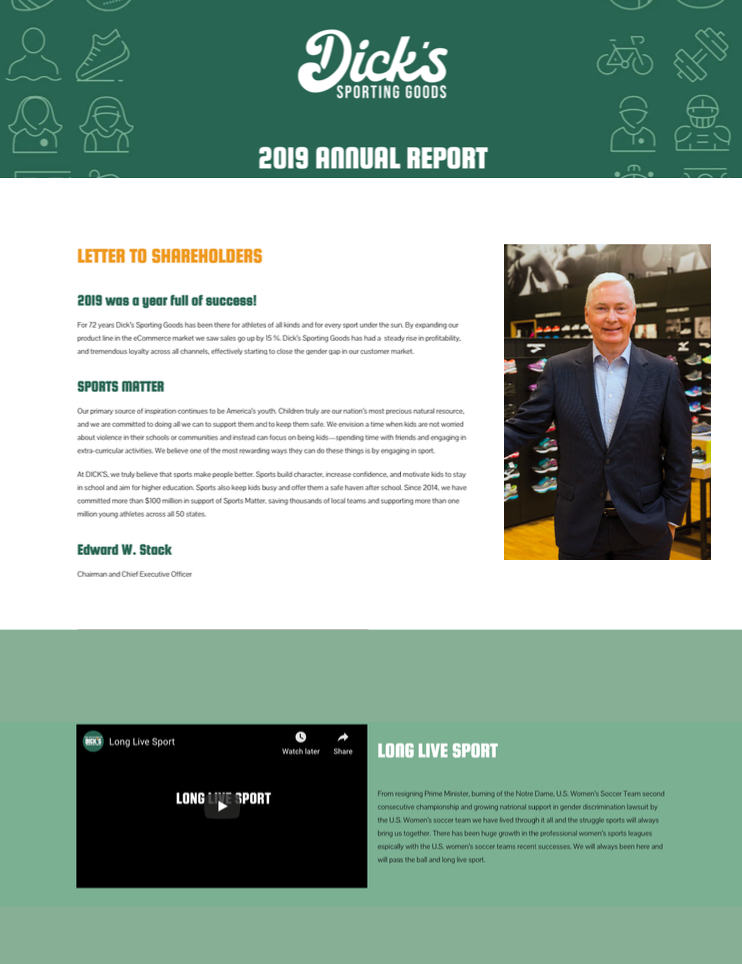
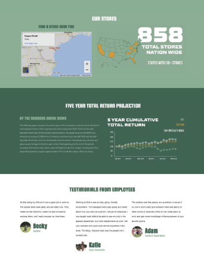
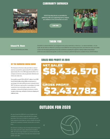
Annual Report
Due to the COVID-19 pandemic this year our annual report was released digitally first with a downloadable link. We wanted to keep our shareholders in the know, especially with the upcoming closure of the first quarter sales. A print document will be mailed to shareholders once quarantine is lifted across the country. This annual report was designed to bring the numbers to life with in-depth explanations also included. There are exciting new total gross sales data and S&P five-year projections.
