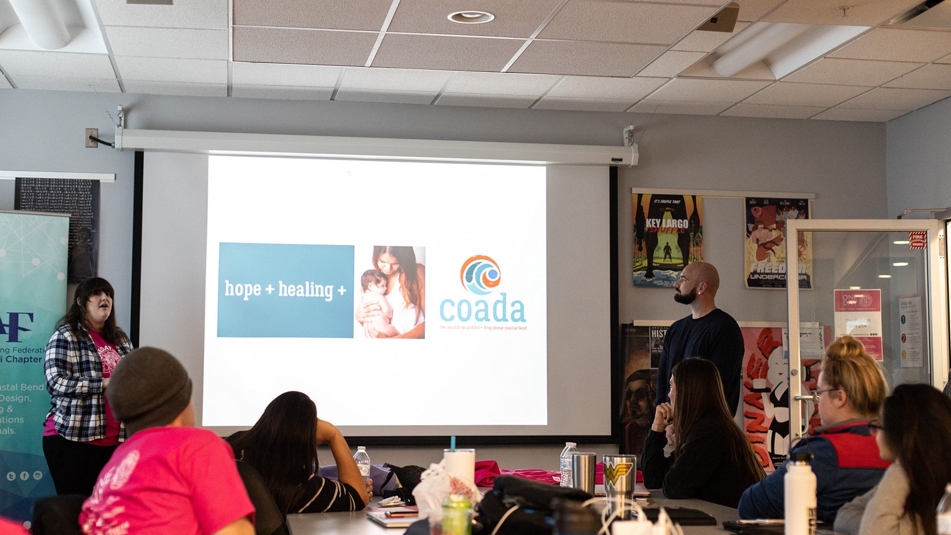
As part of the MFA Organization (MFAO), I’ve helped shape the visual identity and presence of our program: through event posters, the annual MFA Thesis Catalog, and managing our social media. This work balances play, community-building, and professional documentation: from bold, tongue-in-cheek posters for karaoke nights and prom, to a carefully designed catalog that serves as a formal record of our cohort’s work.
Designing for our MFA community has meant more than making visuals—it has also been about documenting and amplifying our collective voice. Through running MFAO’s social accounts, I’ve captured and shared our shows, collaborations, and school events, engaging both current MFA students and our alumni network. Together, these projects show how design can strengthen connection, preserve memory, and build a shared identity across a creative community.
MFAOKE: Freak Show Karaoke Night
Theme & Concept
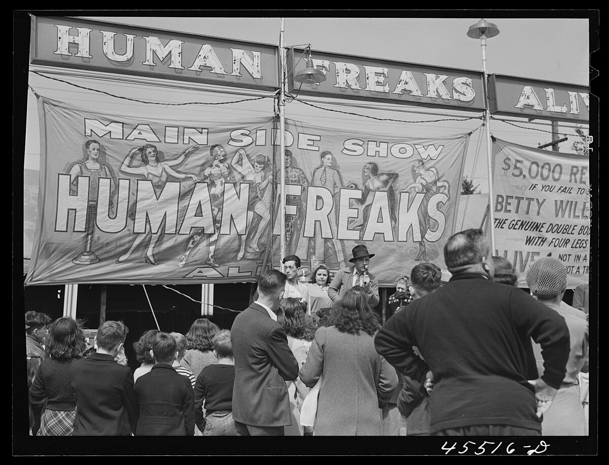
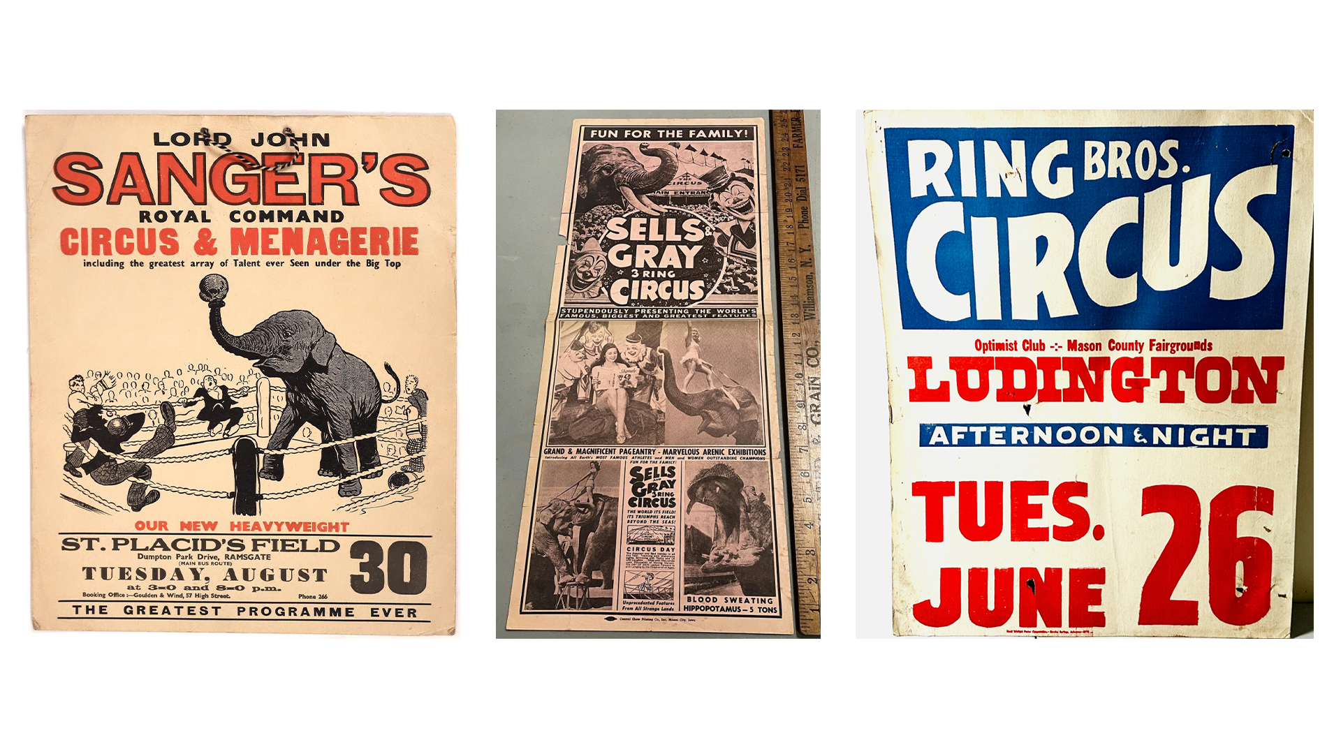
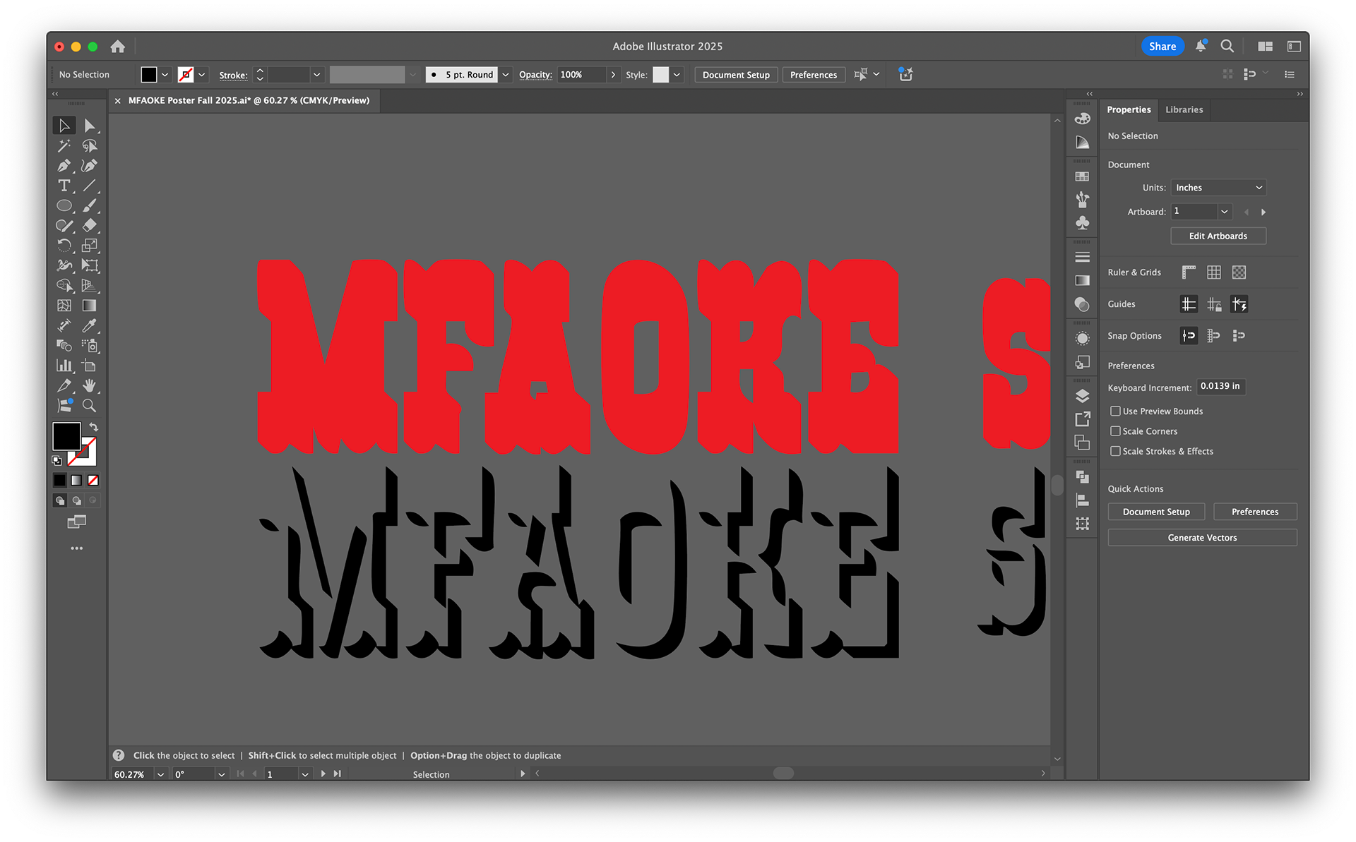
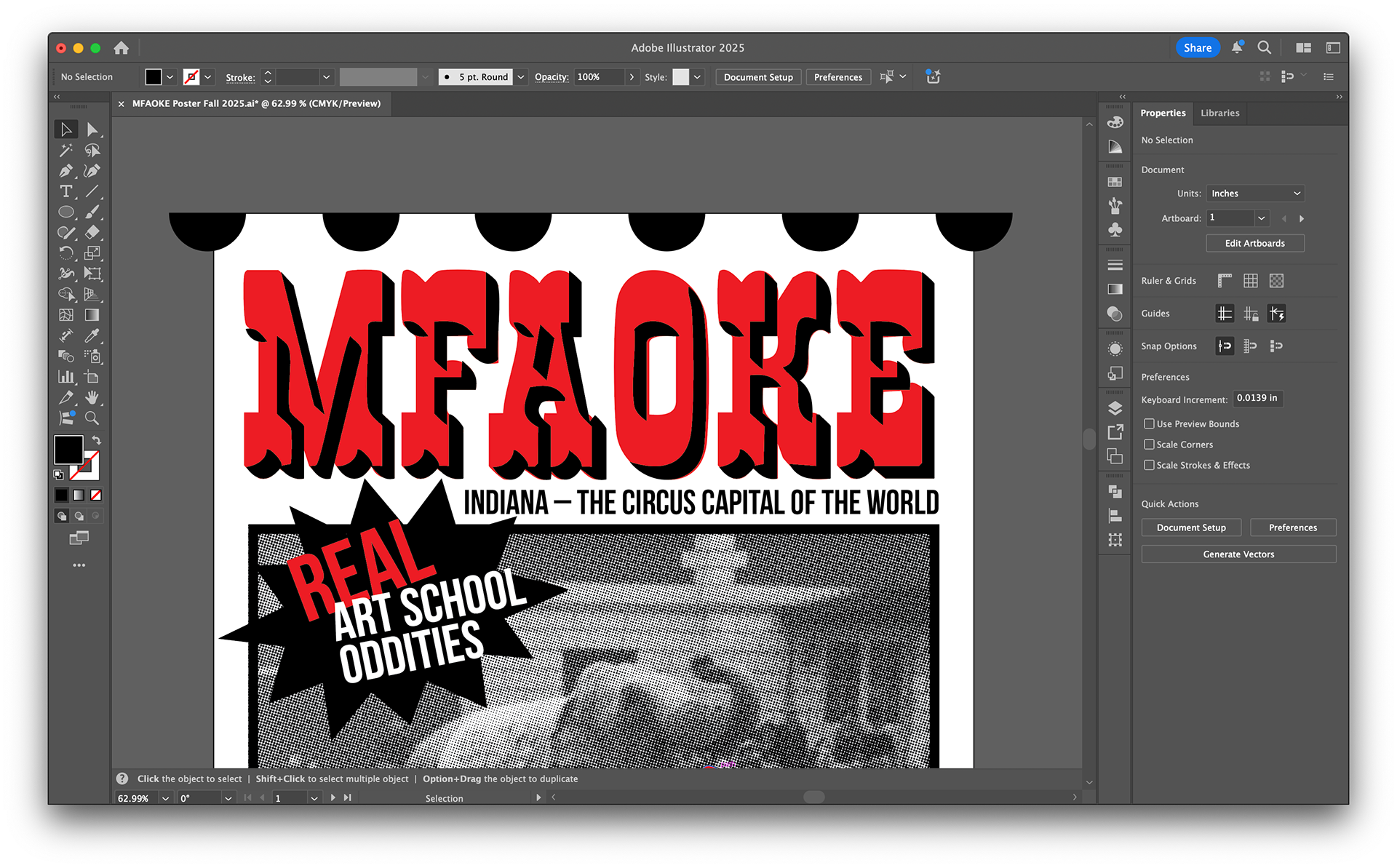
Each year the MFAO organization hosts a themed karaoke night as a chance for graduate students to gather, let loose, and bond outside the studio. The 2025 theme, Freak Show & Circus, drew on the history of spectacle, sideshow oddities, and vintage circus ephemera. My goal was to create a poster that doubled as both event promotion and a playful “ticket” to admission—something fun to hand out and collectible as a memento.
References & Research
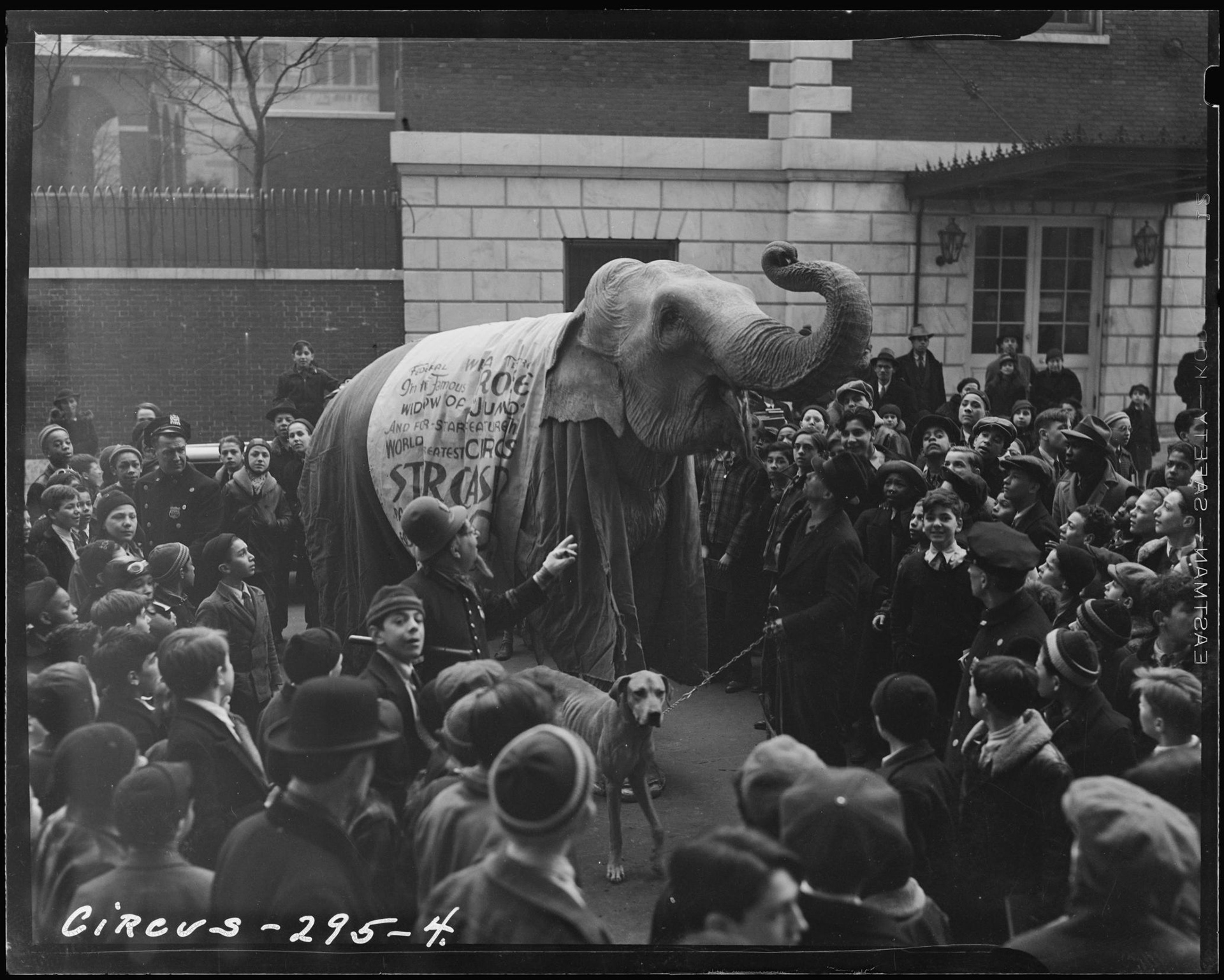
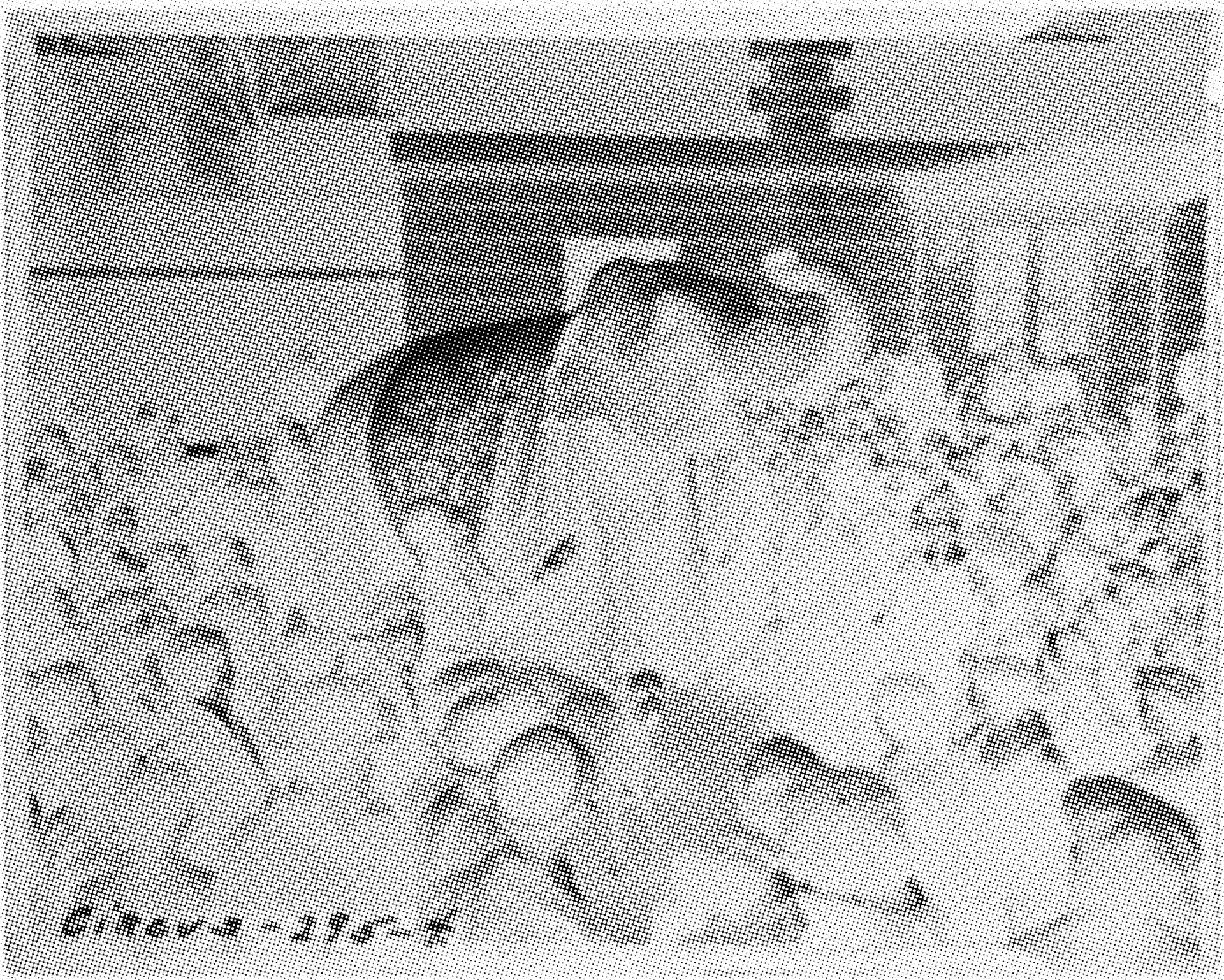
The visual language references 19th-century circus broadsides and advertising posters, as well as letterpress prints from Hatch Show Print. I dug through hundreds of circus photographs in the Library of Congress archives before selecting Image 119 of Circus (1903). This became the central image, tying the poster to historical documentation while allowing room for reinterpretation.
Image 2: Lot 2131: Circus Broadside [147646]
Design Process
The photograph was taken into Photoshop, converted to grayscale, and halftoned to echo period printing techniques.
For laser engraving, the image was inverted to prepare the file for output.
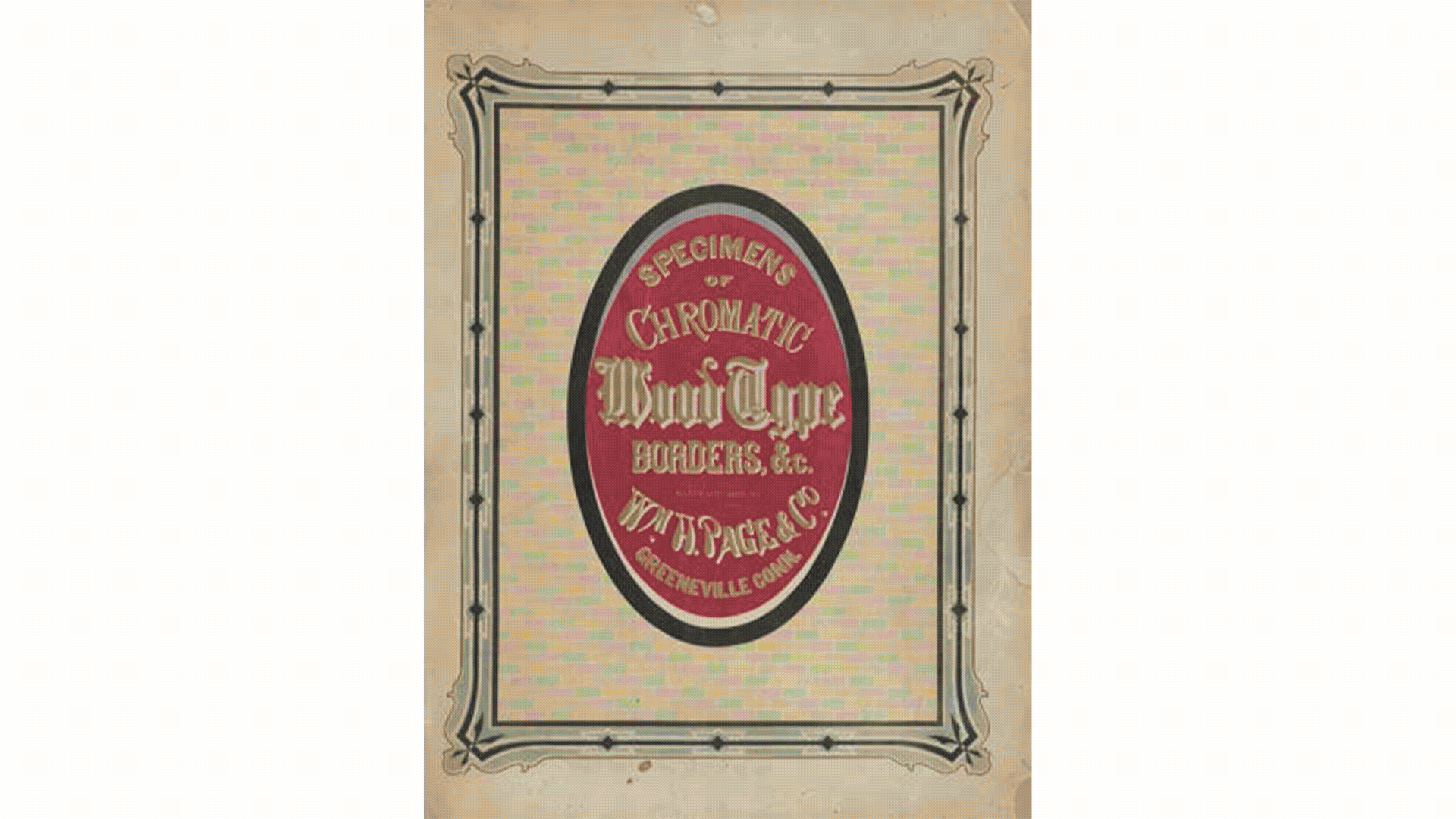
Typography was inspired by Page’s 1874 Specimens of Tuscan wood type. I hand-drew letterforms referencing these historic models, then deliberately digitized them with imperfections to capture the irregularities of actual wood type.
The poster design emphasized bold, type-forward hierarchy, integrating circus tropes with tongue-in-cheek language like “Admit One Weird Vocalist.”
Original Image
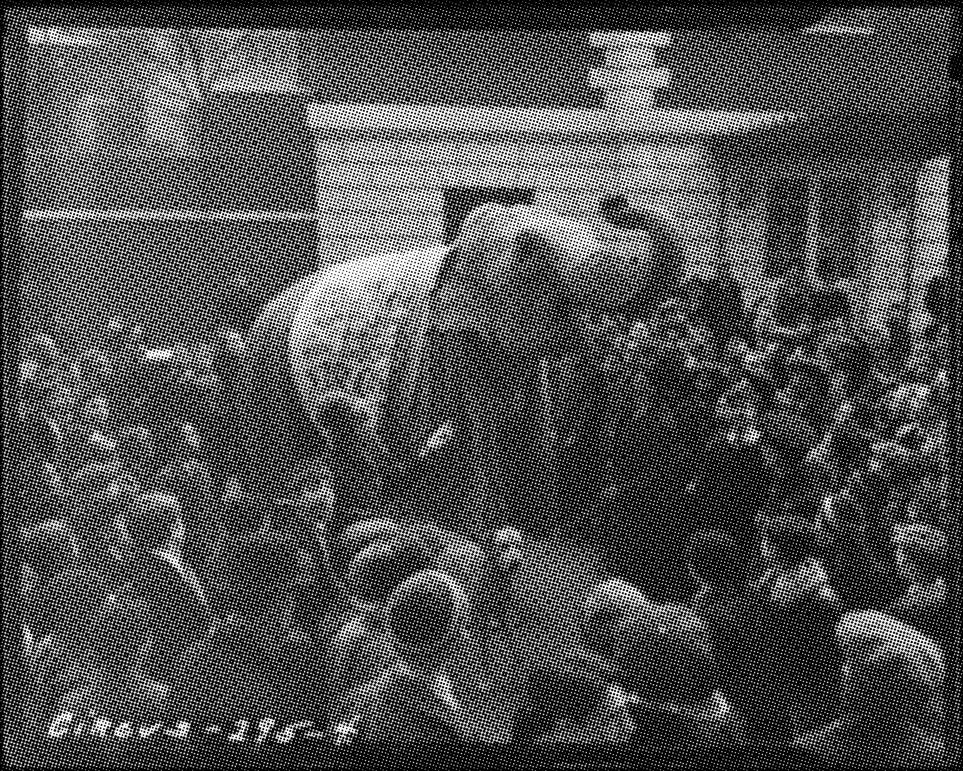
Halftones Added to Image
Halftone Image Inverted for Laser Cutting
Digitized Text in Illustrator
Close up of draft of the poster design in Illustrator.
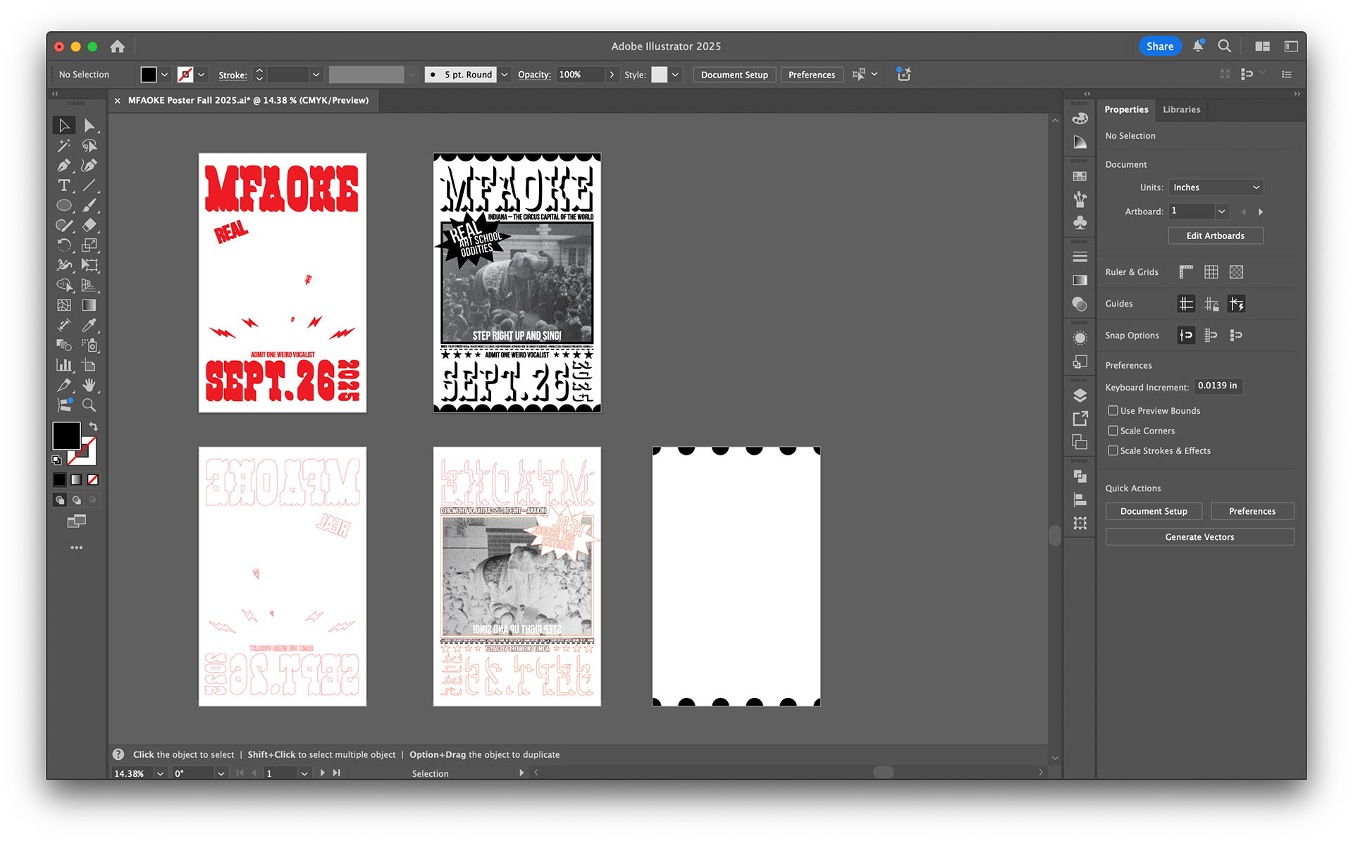
Breakdown of Design File for Laser Cutting
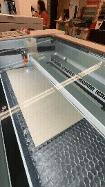
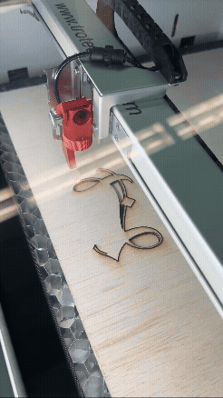
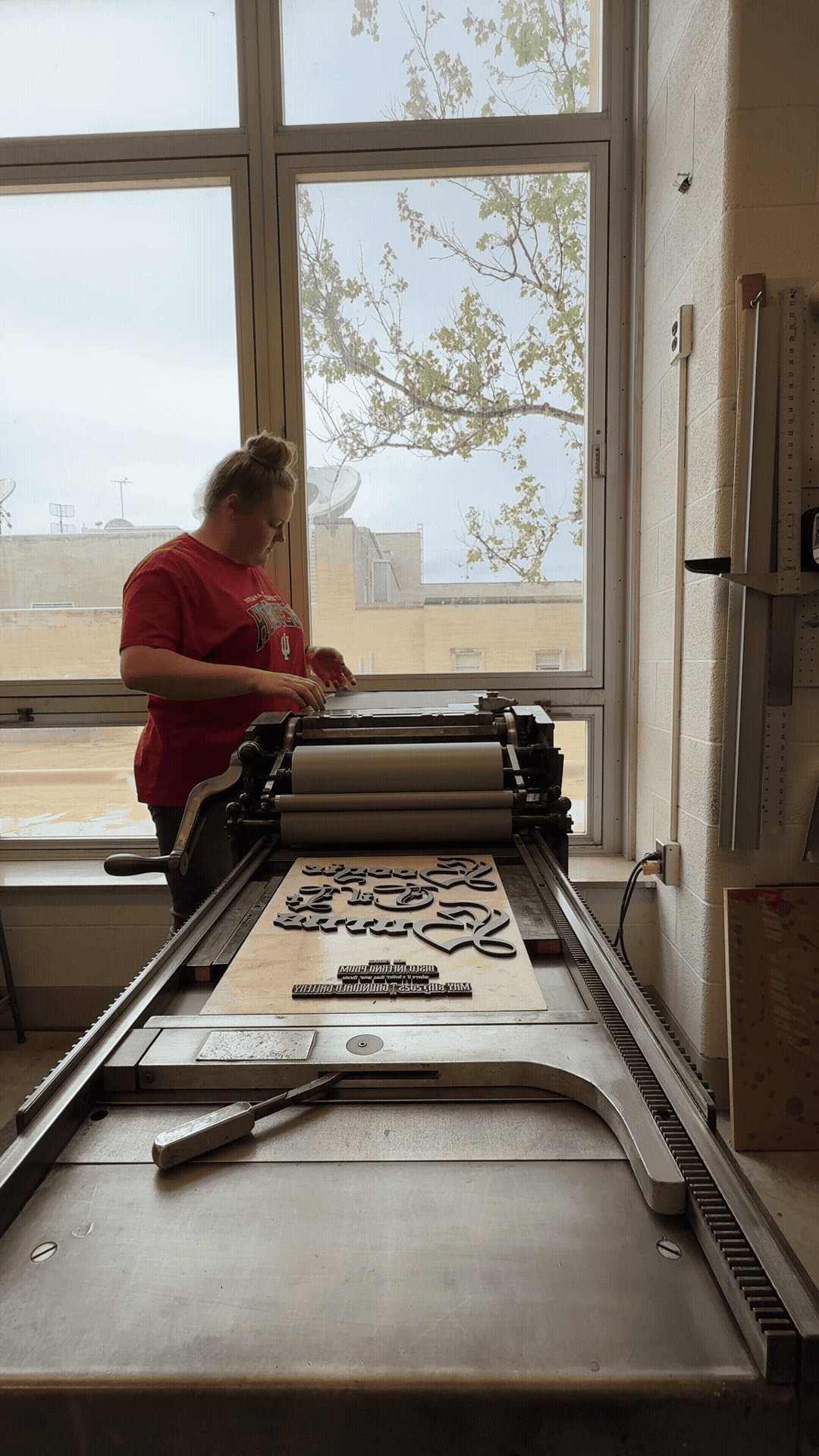
Production
Files were prepped for laser cutting, which allowed me to both engrave (for the halftoned image) and cut (for the larger, bolder text).
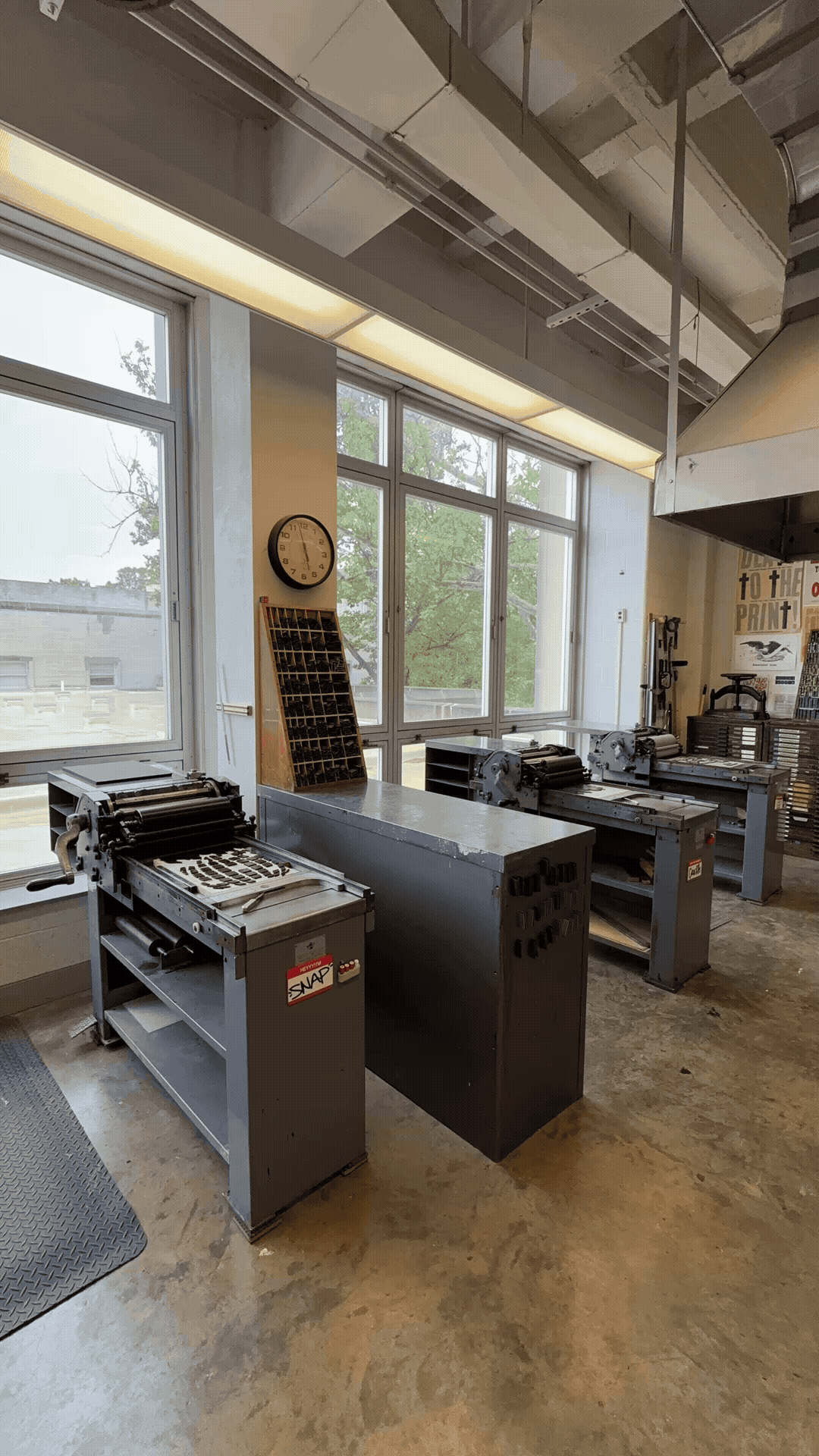
The laser-cut woodblocks were mounted to type-high blocks using double-sided tape and then printed on a Vandercook SP-15 press.
Each color was separated and printed in layers, staying true to letterpress traditions.
To reinforce the ticket concept, the posters were finished with laser-cut scalloped edges, mimicking the perforation of carnival admission stubs at a large scale.
Result
The final poster functions as both an artifact of the event and a nod to Indiana’s history as the “Circus Capital of the World.” With its imperfect typography, halftoned archival photo, and ticket-like form, the piece embodies the playfulness of karaoke, the boldness of circus design, and the tactile qualities of letterpress printing.
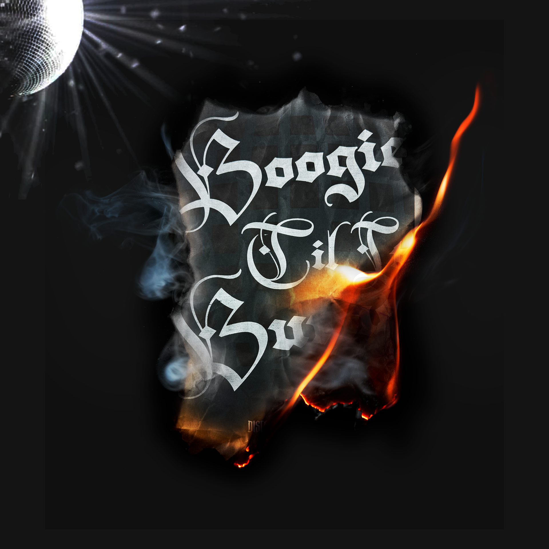
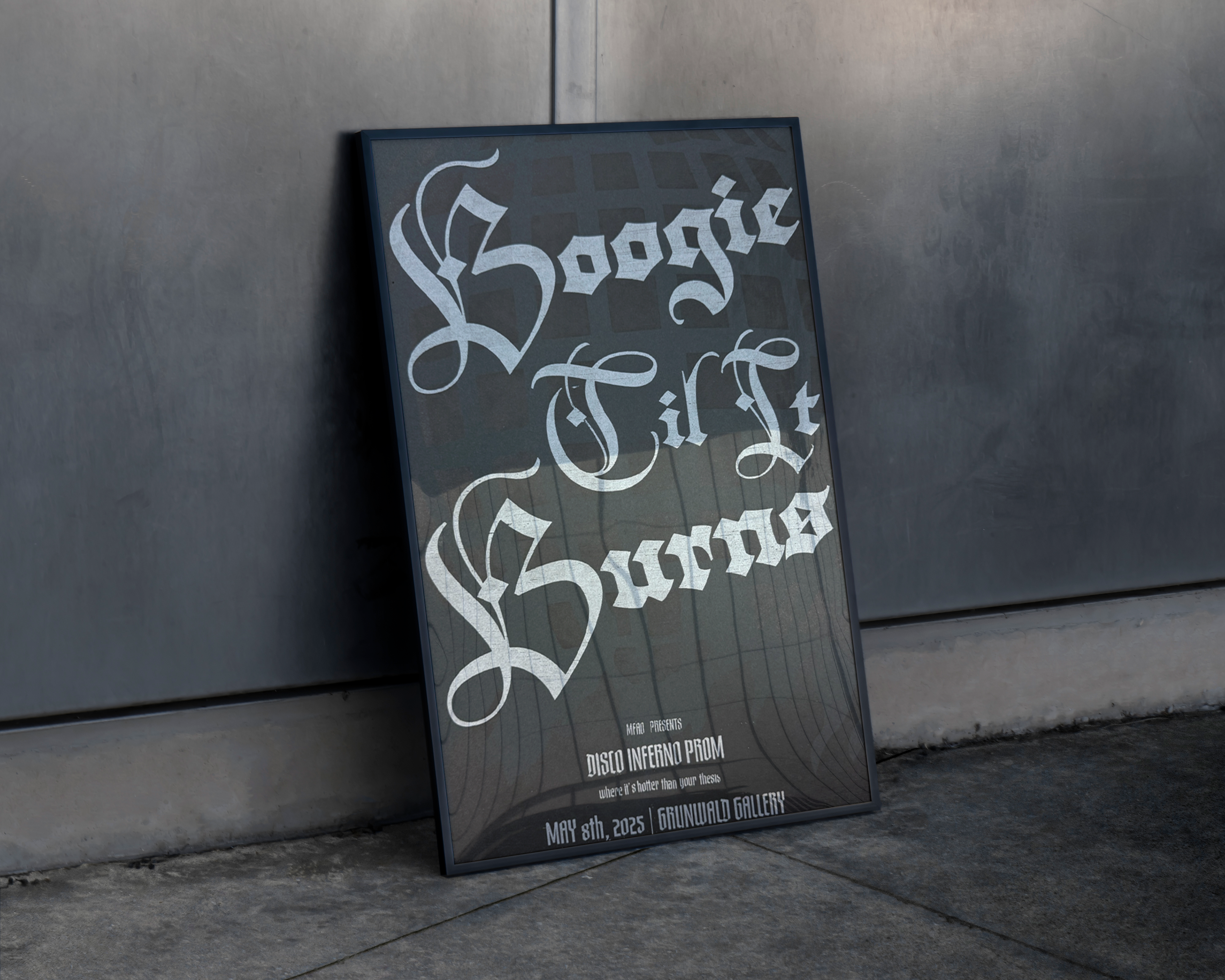
MFA Prom: Disco Inferno
“Boogie ’Til It Burns” | 2025
Poster for MFAO’s spring prom, themed Disco Inferno. Designed with silver ink on black stock, the piece layers a subtle disco ball halftone behind bold Gothic lettering. The tongue-in-cheek subtext — “where it’s hotter than your thesis” — played off the graduate school grind while setting the tone for a playful night. Shown here in both clean presentation and “burning” mockups, the poster embodies the heat, humor, and spectacle of the event.