Open Press Project Exchange 2025
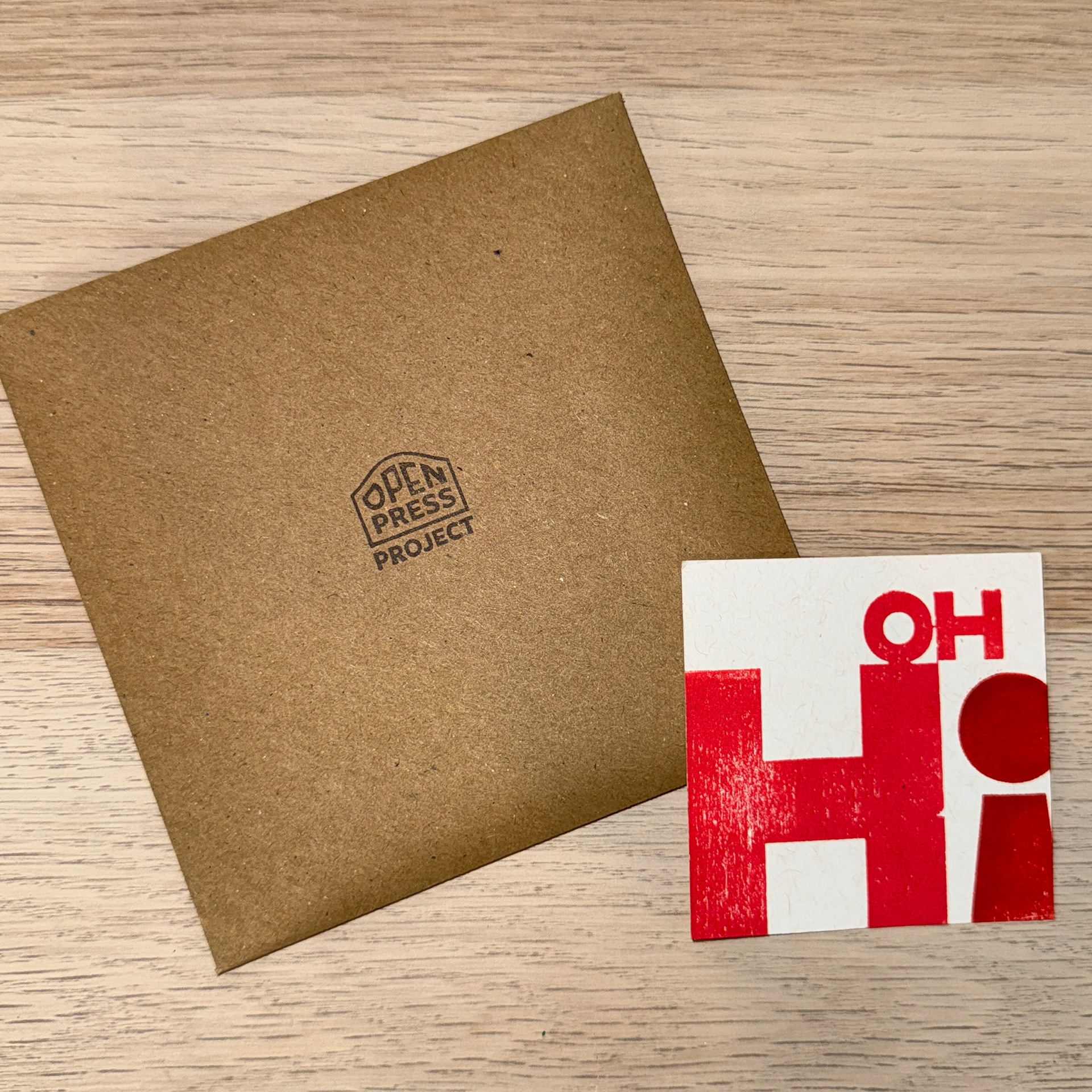
OH Hi
Letterpress print, 2025
Edition of 10 · 7 × 7 cm
Printed on speckletone off-white paper using two shades of red rubber-based ink.
Edition of 10 · 7 × 7 cm
Printed on speckletone off-white paper using two shades of red rubber-based ink.
Created for the 2025 Open Press Project Exchange, this print was produced using a self-assembled 3D-printed miniature printing press built from the Open Press Project’s open-source design files.
The design reads “Oh HI,” with an inverted exclamation mark replacing the “I” — a playful nod to the exchange’s international community.
The minimal composition pairs hand-mixed reds on warm white paper, reflecting the spirit of DIY print culture and accessibility at the heart of the Open Press initiative.
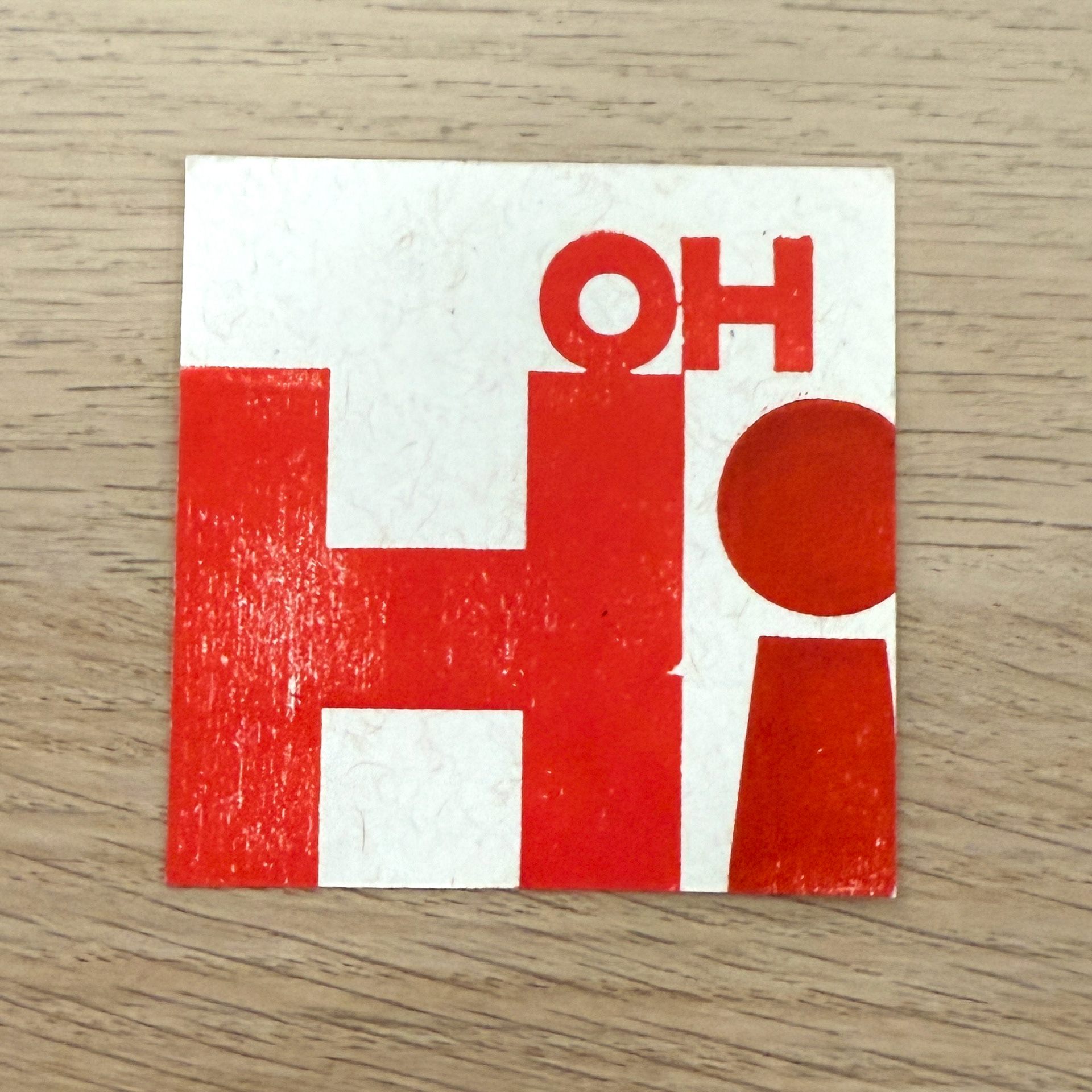
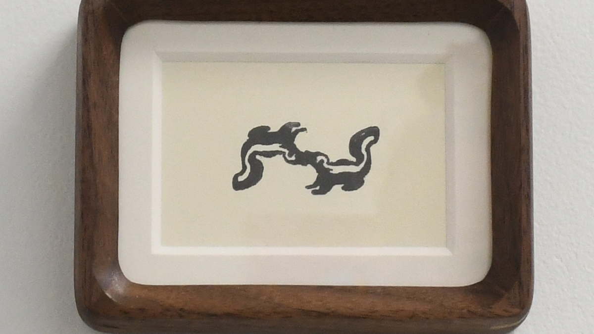
OH Hi - My print for the exchange
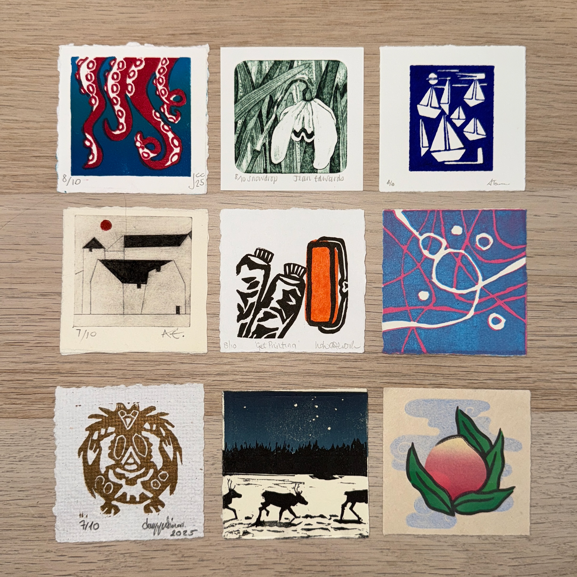
The collection of prints I recieved in return
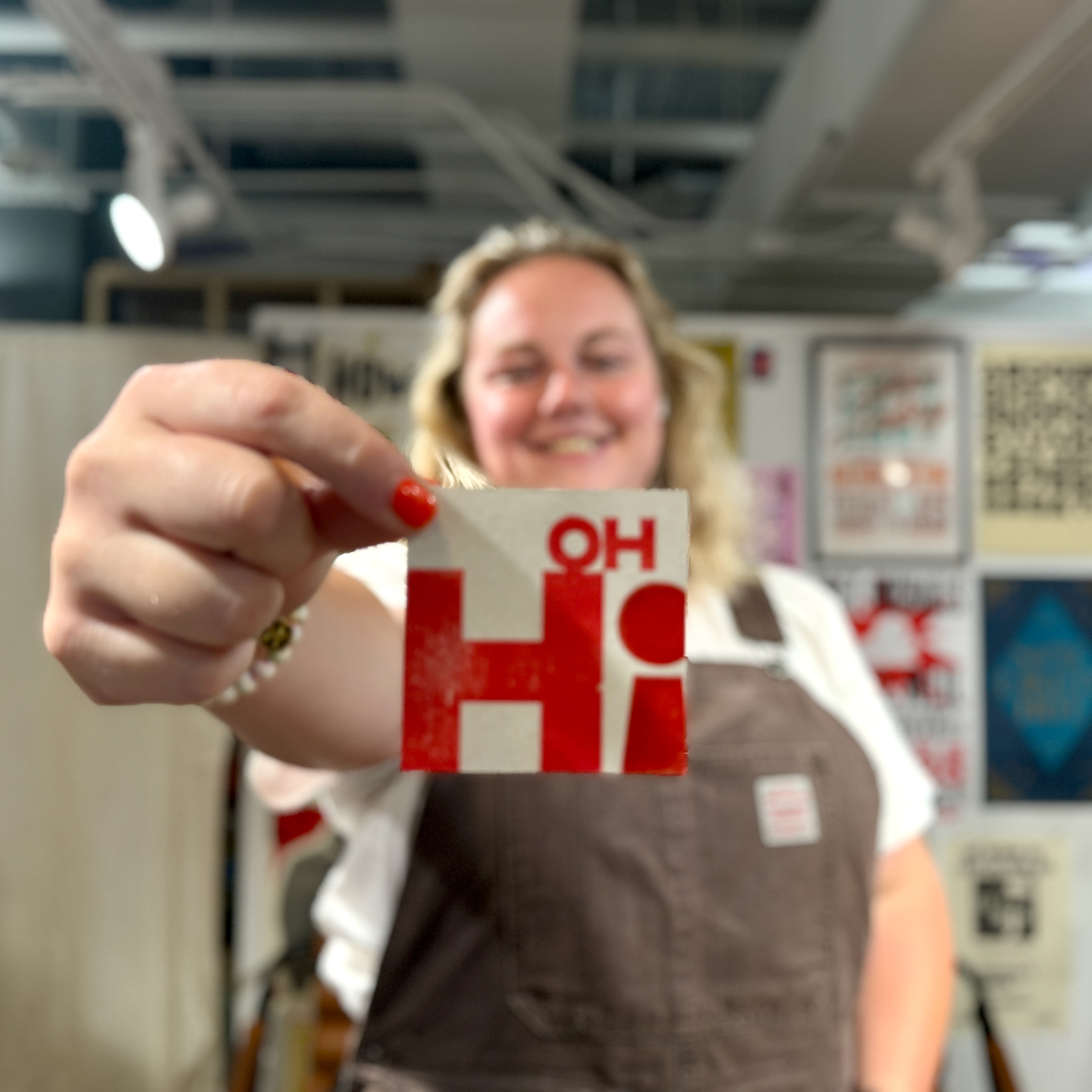
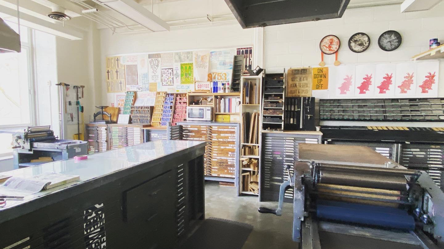
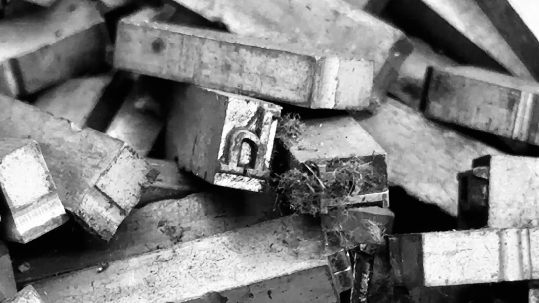
In the studio
9IN Hand International Print Exchange 2024
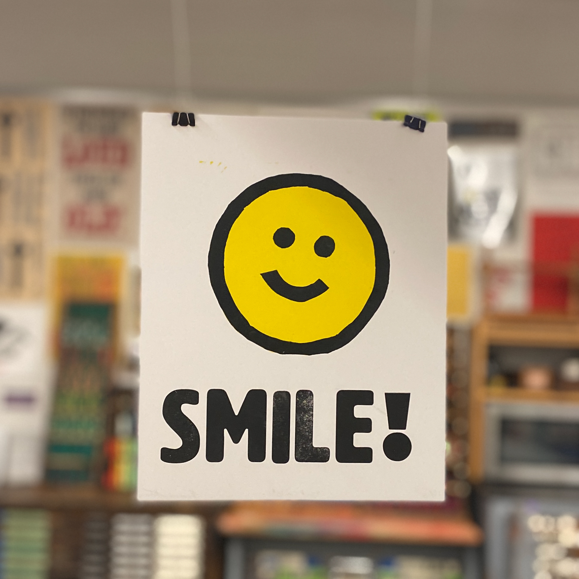
SMILE!
Letterpress print, 2024
Edition of 12 · 8 × 10 in.
Printed on French Paper Smart White with wood type and linoleum cut
Edition of 12 · 8 × 10 in.
Printed on French Paper Smart White with wood type and linoleum cut
Created for the 9IN Hand International Print Exchange, this print began as a quick experiment that became something more playful than planned. I had to pivot mid-process and ended up printing a simple smiley face, later adding SMILE! in wood type for the edition.
While the print itself was minimal and a little rushed, it became a small moment of community — I pulled extra copies for friends in the studio after our critique, and the impromptu exchange reminded me why I love print: it connects people through process, not perfection.
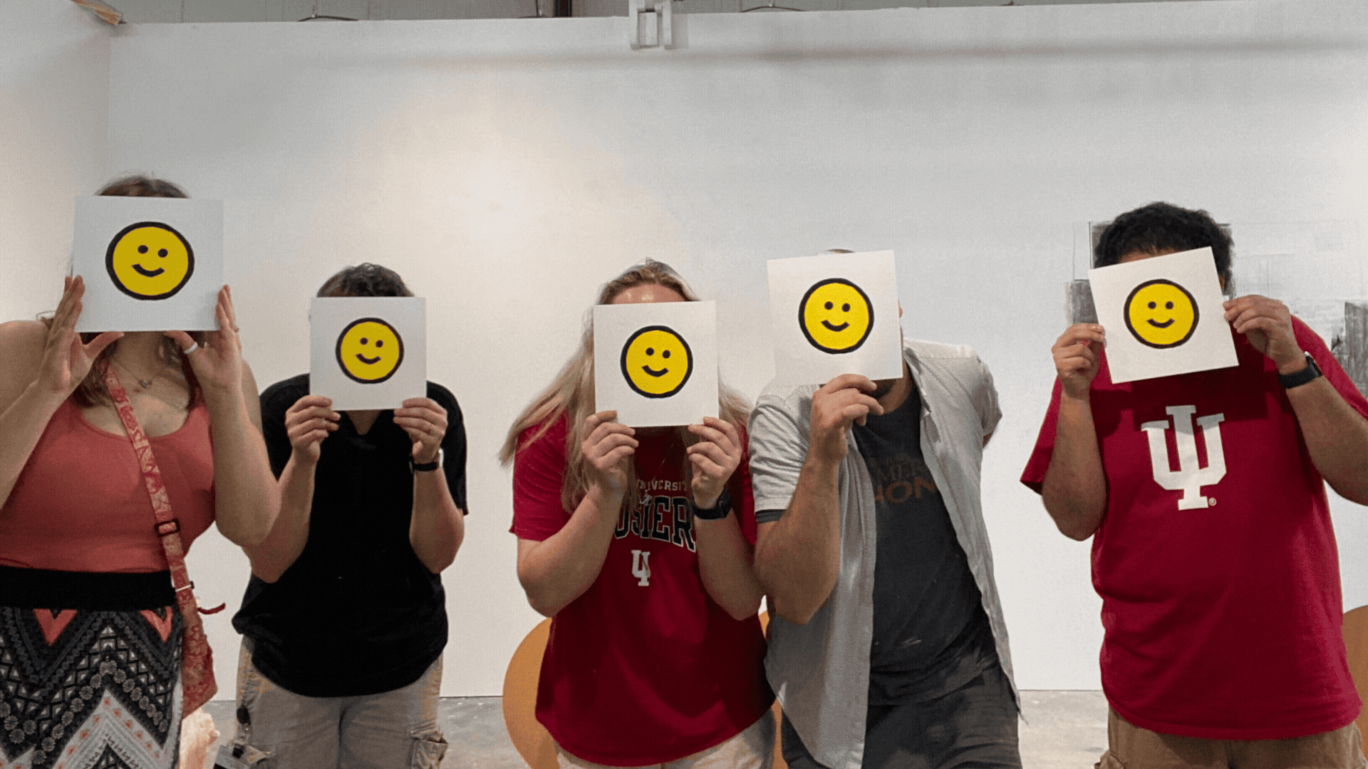
Shared smiles after our group critique —
a reminder that the joy of printmaking lives in both the making and the sharing
Mini Midwest Print Fest 2025
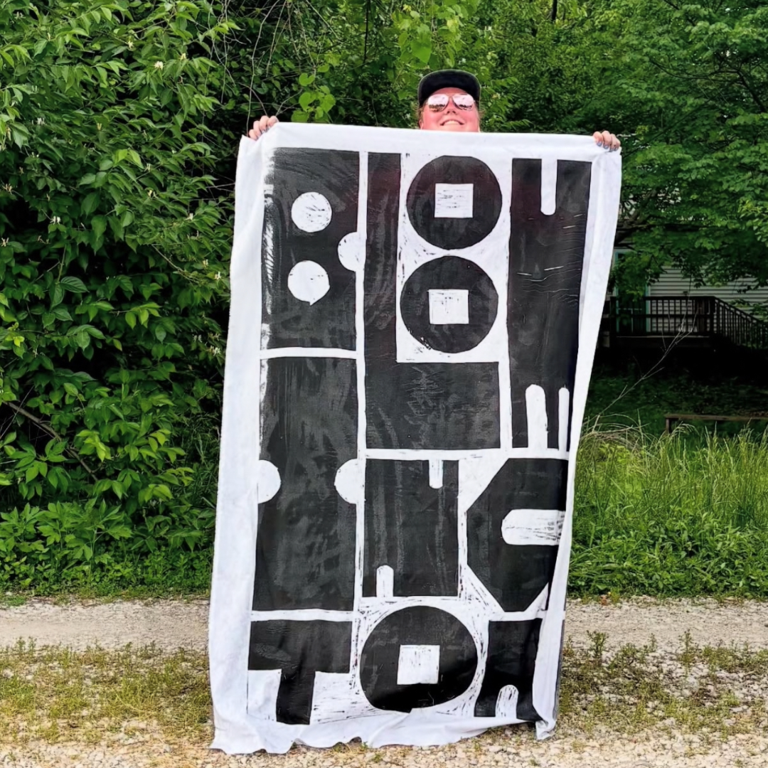
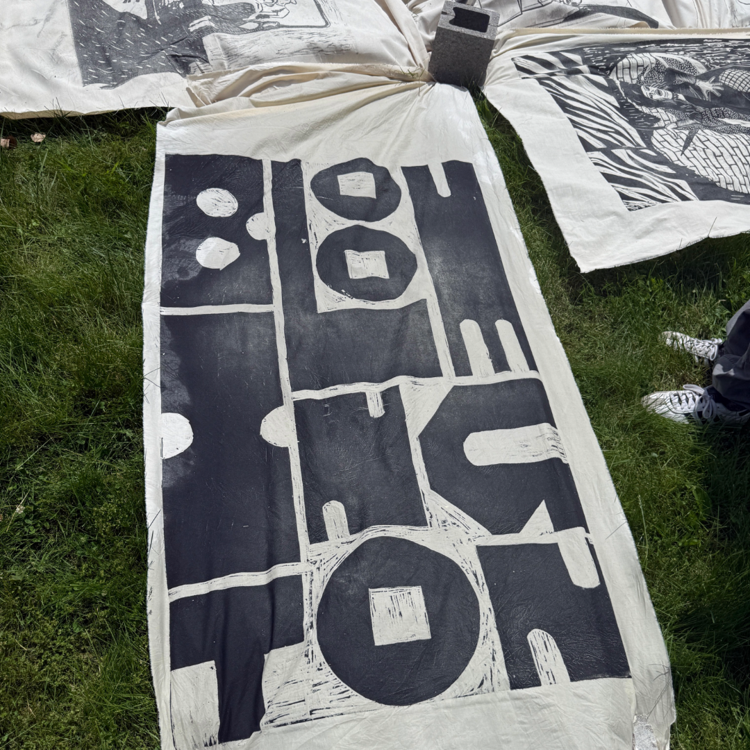
Untitled (Bloomington Grid)
Relief print, 2025
3 × 5 ft
3 × 5 ft
Printed via steamroller on bleached and unbleached muslin
Created for the Mini Midwest Print Fest in Bloomington, Indiana, this piece marks my first large-scale community print event—and my largest carving to date. The design is built from a typographic grid inspired by Bloomington’s city layout, translating the rhythm of its streets into a composition of bold, modular letterforms.
The system follows a variable grid logic: each character can expand vertically or horizontally within a fixed square unit, forming a flexible typographic structure that shifts between compression and extension. I’m interested in developing this approach further as a future Homage Press release—a contemporary interpretation of modular wood type that nods to systems like P22 Alpha Blox while leaning into a more geometric, structural sensibility.
Among the intricate wildlife and figurative prints surrounding me, my chunky, abstract letterforms felt almost too minimal. But that contrast became part of the work’s point. I’ve learned to see these typographic prints not as less detailed, but as another form of storytelling—one built from geometry, texture, and presence rather than imagery.
Printmaking reminds me that complexity isn’t only in the image — it’s in the process, the pressure, and the shared experience of pulling a print.
Prints drying on the hill.
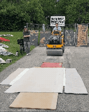
Steamroller in action.
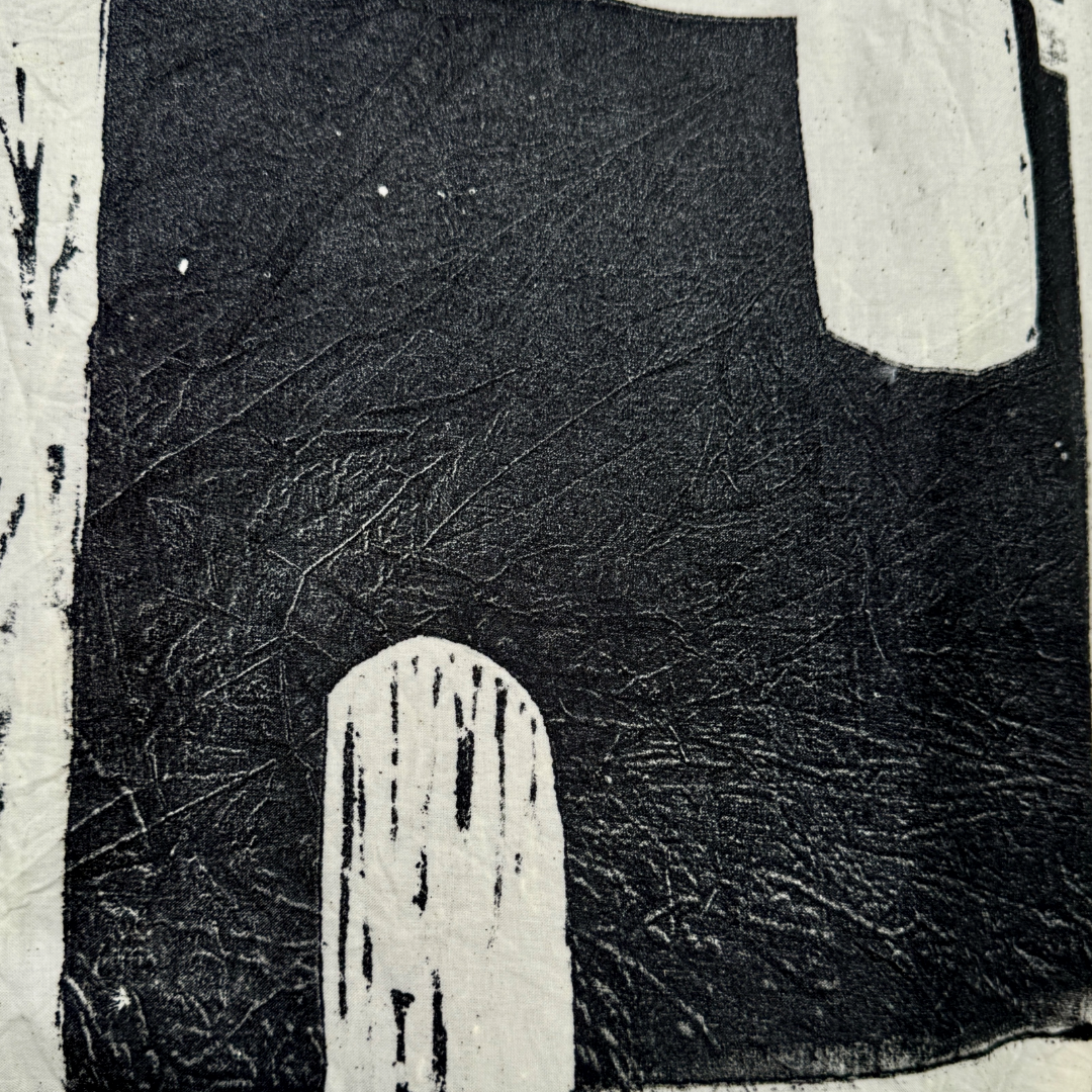
Lovely textures happening.
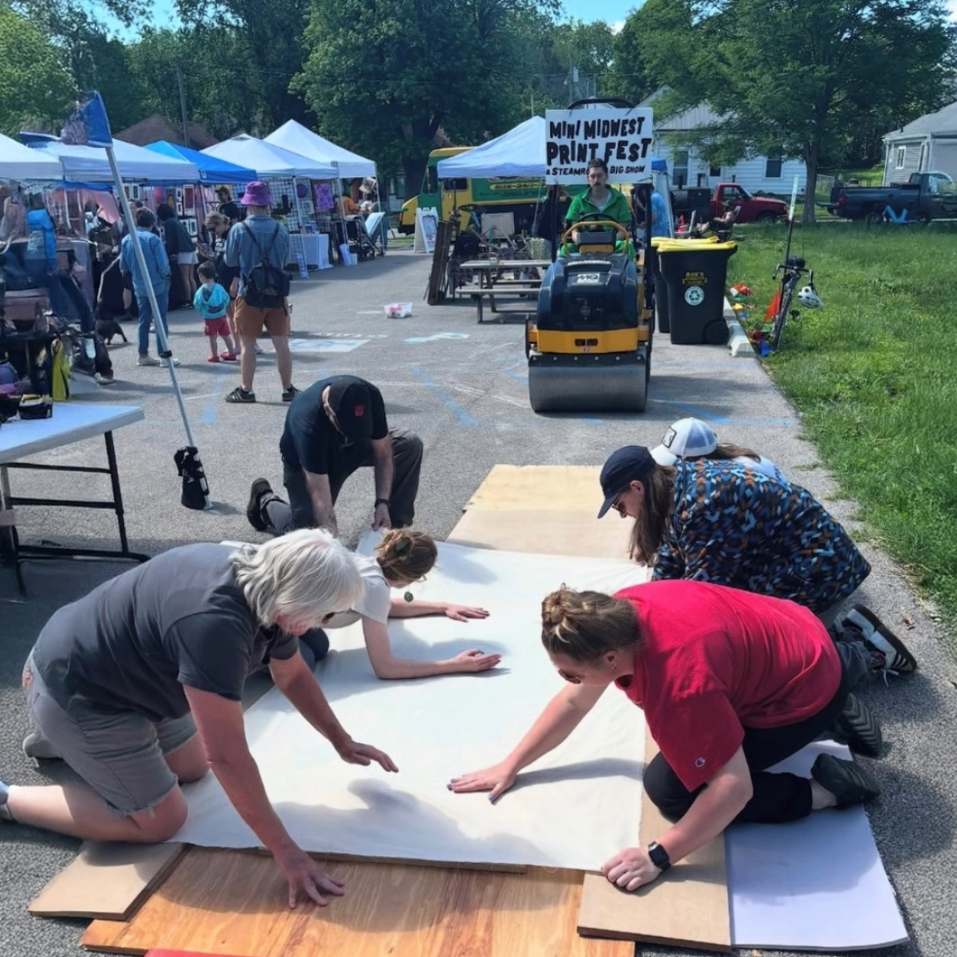
Setting up the next print.
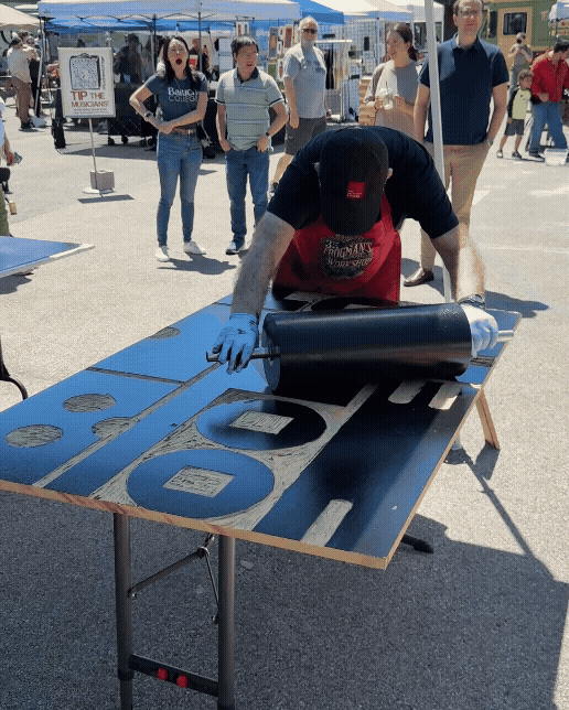
Inking the block. Thank you Hoofprint Chicago for you help!
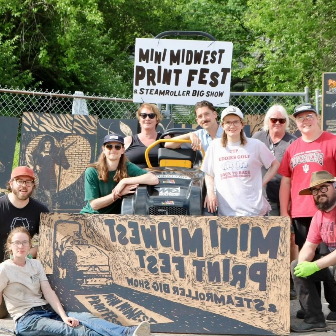
Group photo! Shoutout to Bad Knees, Hideout Press and Hoofprint for organizing this awesome event.